 Menu
Menu
I know it's possible to get an overall 'neon' like effect to text using text-shadows, but is it possible to give text the more asymmetric, 'horizontal' type flare as seen in movies, usually referred to as anamorphic lens flares? (see example).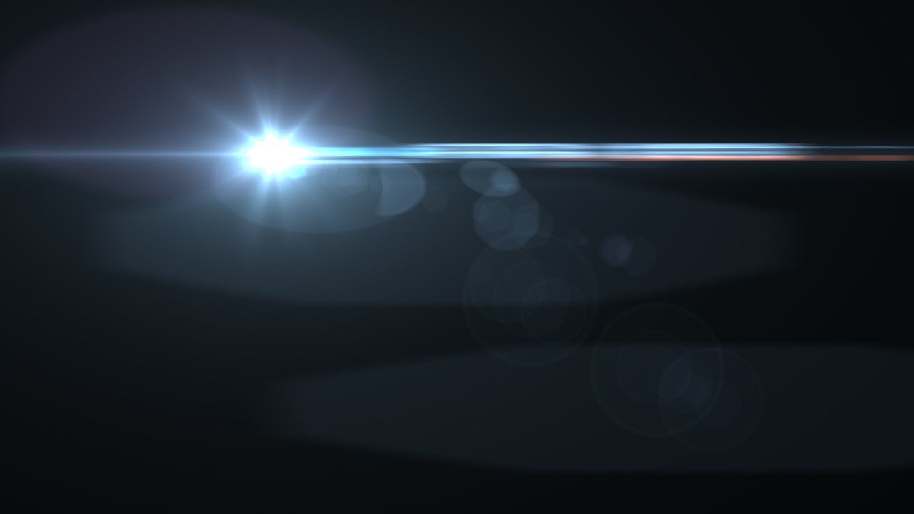
EDIT:
Here is an example http://dabblet.com/gist/11479993
The text here shows four levels of text-shadows using blur to approximate a symmetrical 'glow' around it. Is there a way to only increase this effect on the right and left sides only, so that there is a horizontal-like glow effect that converges into an imaginary horizontal axis that running through the middle of the text.
Here is the CSS I'm using:
.outer {
    position: relative;
    height: 100px;
    width: 100px;
    background-color: black;
}
.inner {
    position: relative;
    margin: 0 auto;
    height: 90px;
    width: 90px;
    background-color: blue;
}
.float {
    position: absolute;
    top: 50%;
    left: 50%;
    height: 10px;
    width: 10px;
    background-color: yellow;
}
.text {
    color: white;
    font-size: 2em;
    text-align: center;
    text-shadow: 2px 1px 150px #FFF, 2px 0 60px #FFF, 2px 0 5px #FFF;
}
and HTML:
<div class='outer'>
    <div class='text'>s</div>
</div>
 847
847
You can potentially create one o more ellipses in CSS.
You would need to add gradients as colors as to simulate your effect.
Here just a brief example:
http://jsfiddle.net/w2rcy270/2/
#effect {
    width: 200px;
    height: 100px;
    background: red;
    -moz-border-radius: 100px / 50px;
    -webkit-border-radius: 100px / 50px;
    border-radius: 100px / 50px;
    background: rgb(240, 183, 161);
    background: -moz-radial-gradient(center, ellipse cover, rgba(240, 183, 161, 1) 0%, rgba(140, 51, 16, 1) 48%, rgba(191, 110, 78, 1) 100%);
    background: -webkit-gradient(radial, center center, 0px, center center, 100%, color-stop(0%, rgba(240, 183, 161, 1)), color-stop(48%, rgba(140, 51, 16, 1)), color-stop(100%, rgba(191, 110, 78, 1)));
    background: -webkit-radial-gradient(center, ellipse cover, rgba(240, 183, 161, 1) 0%, rgba(140, 51, 16, 1) 48%, rgba(191, 110, 78, 1) 100%);
    background: -o-radial-gradient(center, ellipse cover, rgba(240, 183, 161, 1) 0%, rgba(140, 51, 16, 1) 48%, rgba(191, 110, 78, 1) 100%);
    background: -ms-radial-gradient(center, ellipse cover, rgba(240, 183, 161, 1) 0%, rgba(140, 51, 16, 1) 48%, rgba(191, 110, 78, 1) 100%);
    background: radial-gradient(ellipse at center, rgba(240, 183, 161, 1) 0%, rgba(140, 51, 16, 1) 48%, rgba(191, 110, 78, 1) 100%);
    filter: progid:DXImageTransform.Microsoft.gradient(startColorstr='#f0b7a1', endColorstr='#bf6e4e', GradientType=1);
}
If you love us? You can donate to us via Paypal or buy me a coffee so we can maintain and grow! Thank you!
Donate Us With