 Menu
Menu
I have a simple list view that contains two rows.
Each row contains two text views. View one and View two.
I would like to align the last label (View two) in each row so that the name labels are leading aligned and keep being aligned regardless of font size.
The first label (View one) also needs to be leading aligned.
I've tried setting a min frame width on the first label (View One) but it doesn't work. It also seems impossible to set the min width and also to get a text view to be leading aligned in View One.
Any ideas? This is fairly straight forward in UIKit.

 766
766
I've found a way to fix this that supports dynamic type and isn't hacky. The answer is using PreferenceKeys and GeometryReader!
The essence of this solution is that each number Text will have a width that it will be drawn with depending on its text size. GeometryReader can detect this width and then we can use PreferenceKey to bubble it up to the List itself, where the max width can be kept track of and then assigned to each number Text's frame width.
A PreferenceKey is a type you create with an associated type (can be any struct conforming to Equatable, this is where you store the data about the preference) that is attached to any View and when it is attached, it bubbles up through the view tree and can be listened to in an ancestor view by using .onPreferenceChange(PreferenceKeyType.self).
To start, we'll create our PreferenceKey type and the data it contains:
struct WidthPreferenceKey: PreferenceKey {
    typealias Value = [WidthPreference]

    static var defaultValue: [WidthPreference] = []

    static func reduce(value: inout [WidthPreference], nextValue: () -> [WidthPreference]) {
        value.append(contentsOf: nextValue())
    }
}

struct WidthPreference: Equatable {
    let width: CGFloat
}
Next, we'll create a View called WidthPreferenceSettingView that will be attached to the background of whatever we want to size (in this case, the number labels). This will take care of setting the preference which will pass up this number label's preferred width with PreferenceKeys.
struct WidthPreferenceSettingView: View {
    var body: some View {
        GeometryReader { geometry in
            Rectangle()
                .fill(Color.clear)
                .preference(
                    key: WidthPreferenceKey.self,
                    value: [WidthPreference(width: geometry.frame(in: CoordinateSpace.global).width)]
                )
        }
    }
}
Lastly, the list itself! We have an @State variable which is the width of the numbers "column" (not really a column in the sense that the numbers don't directly affect other numbers in code). Through .onPreferenceChange(WidthPreference.self) we listen to changes in the preference we created and store the max width in our width state. After all of the number labels have been drawn and their width read by the GeometryReader, the widths propagate back up and the max width is assigned by .frame(width: width)
struct ContentView: View {
    @State private var width: CGFloat? = nil

    var body: some View {
        List {
            HStack {
                Text("1. ")
                    .frame(width: width, alignment: .leading)
                    .lineLimit(1)
                    .background(WidthPreferenceSettingView())
                Text("John Smith")
            }
            HStack {
                Text("20. ")
                    .frame(width: width, alignment: .leading)
                    .lineLimit(1)
                    .background(WidthPreferenceSettingView())
                Text("Jane Done")
            }
            HStack {
                Text("2000. ")
                    .frame(width: width, alignment: .leading)
                    .lineLimit(1)
                    .background(WidthPreferenceSettingView())
                Text("Jax Dax")
            }
        }.onPreferenceChange(WidthPreferenceKey.self) { preferences in
            for p in preferences {
                let oldWidth = self.width ?? CGFloat.zero
                if p.width > oldWidth {
                    self.width = p.width
                }
            }
        }
    }
}
If you have multiple columns of data, one way to scale this is to make an enum of your columns or to index them, and the @State for width would become a dictionary where each key is a column and .onPreferenceChange compares against the key-value for the max width of a column.
To show results, this is what it looks like with larger text turned on, works like a charm :).
This article on PreferenceKey and inspecting the view tree helped tremendously: https://swiftui-lab.com/communicating-with-the-view-tree-part-1/
117
I just had to deal with this. The solutions that rely on a fixed width frame won't work for dynamic type, so I couldn't use them. The way I got around it was by putting the flexible item (the left number in this case) in a ZStack with a placeholder containing the widest allowable content, and then setting the placeholder's opacity to 0:
ZStack {
    Text("9999")
        .opacity(0)
        .accessibility(visibility: .hidden)
    Text(id)
}
It's pretty hacky, but at least it supports dynamic type 🤷♂️
Full example below! 📜
import SwiftUI
struct Person: Identifiable {
var name: String
var id: Int
}
struct IDBadge : View {
var id: Int
var body: some View {
ZStack(alignment: .trailing) {
Text("9999.") // The maximum width dummy value
.font(.headline)
.opacity(0)
.accessibility(visibility: .hidden)
Text(String(id) + ".")
.font(.headline)
}
}
}
struct ContentView : View {
var people: [Person]
var body: some View {
List(people) { person in
HStack(alignment: .top) {
IDBadge(id: person.id)
Text(person.name)
.lineLimit(nil)
}
}
}
}
#if DEBUG
struct ContentView_Previews : PreviewProvider {
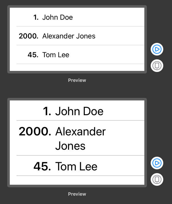
static let people = [Person(name: "John Doe", id: 1), Person(name: "Alexander Jones", id: 2000), Person(name: "Tom Lee", id: 45)]
static var previews: some View {
Group {
ContentView(people: people)
.previewLayout(.fixed(width: 320.0, height: 150.0))
ContentView(people: people)
.environment(\.sizeCategory, .accessibilityMedium)
.previewLayout(.fixed(width: 320.0, height: 200.0))
}
}
}
#endif
With Swift 5.2 and iOS 13, you can use PreferenceKey protocol, preference(key:value:) method and onPreferenceChange(_:perform:) method to solve this problem.
You can implement the code for the View proposed by OP in 3 major steps, as shown below.
import SwiftUI

struct ContentView: View {

    var body: some View {
        NavigationView {
            List {
                HStack {
                    Text("5.")
                    Text("John Smith")
                }
                HStack {
                    Text("20.")
                    Text("Jane Doe")
                }
            }
            .listStyle(GroupedListStyle())
            .navigationBarTitle("Challenge")
        }
    }

}
The idea here is to collect all the widths for the Texts that represent a rank and assign the widest among them to the width property of ContentView.
import SwiftUI

struct WidthPreferenceKey: PreferenceKey {

    static var defaultValue: [CGFloat] = []
    static func reduce(value: inout [CGFloat], nextValue: () -> [CGFloat]) {
        value.append(contentsOf: nextValue())
    }

}

struct ContentView: View {

    @State private var width: CGFloat? = nil

    var body: some View {
        NavigationView {
            List {
                HStack {
                    Text("5.")
                        .overlay(
                            GeometryReader { proxy in
                                Color.clear
                                    .preference(
                                        key: WidthPreferenceKey.self,
                                        value: [proxy.size.width]
                                    )
                            }
                        )
                        .frame(width: width, alignment: .leading)
                    Text("John Smith")
                }
                HStack {
                    Text("20.")
                        .overlay(
                            GeometryReader { proxy in
                                Color.clear
                                    .preference(
                                        key: WidthPreferenceKey.self,
                                        value: [proxy.size.width]
                                    )
                            }
                        )
                        .frame(width: width, alignment: .leading)
                    Text("Jane Doe")
                }
            }
            .onPreferenceChange(WidthPreferenceKey.self) { widths in
                if let width = widths.max() {
                    self.width = width
                }
            }
            .listStyle(GroupedListStyle())
            .navigationBarTitle("Challenge")
        }
    }

}
To make our code reusable, we can refactor our preference logic into a ViewModifier.
import SwiftUI

struct WidthPreferenceKey: PreferenceKey {

    static var defaultValue: [CGFloat] = []
    static func reduce(value: inout [CGFloat], nextValue: () -> [CGFloat]) {
        value.append(contentsOf: nextValue())
    }

}

struct EqualWidth: ViewModifier {

    func body(content: Content) -> some View {
        content
            .overlay(
                GeometryReader { proxy in
                    Color.clear
                        .preference(
                            key: WidthPreferenceKey.self,
                            value: [proxy.size.width]
                        )
                }
            )
    }

}

extension View {
    func equalWidth() -> some View {
        modifier(EqualWidth())
    }
}

struct ContentView: View {

    @State private var width: CGFloat? = nil

    var body: some View {
        NavigationView {
            List {
                HStack {
                    Text("5.")
                        .equalWidth()
                        .frame(width: width, alignment: .leading)
                    Text("John Smith")
                }
                HStack {
                    Text("20.")
                        .equalWidth()
                        .frame(width: width, alignment: .leading)
                    Text("Jane Doe")
                }
            }
            .onPreferenceChange(WidthPreferenceKey.self) { widths in
                if let width = widths.max() {
                    self.width = width
                }
            }
            .listStyle(GroupedListStyle())
            .navigationBarTitle("Challenge")
        }
    }

}
The result looks like this:
 13
13
Here are three options to do it statically.
struct ContentView: View {
    @State private var width: CGFloat? = 100

    var body: some View {
        List {
            HStack {
                Text("1. ")
                    .frame(width: width, alignment: .leading)
                    .lineLimit(1)
                    .background(Color.blue)
                // Option 1
                Text("John Smith")
                    .multilineTextAlignment(.leading)
                    //.frame(minWidth: 0, maxWidth: .infinity, alignment: .leading)
                    .background(Color.green)
            }
            HStack {
                Text("20. ")
                    .frame(width: width, alignment: .leading)
                    .lineLimit(1)
                    .background(Color.blue)
                // Option 2 (works mostly like option 1)
                Text("Jane Done")
                    .background(Color.green)
                Spacer()
            }
            HStack {
                Text("2000. ")
                    .frame(width: width, alignment: .leading)
                    .lineLimit(1)
                    .background(Color.blue)
                // Option 3 - takes all the rest space to the right
                Text("Jax Dax")
                    .frame(minWidth: 0, maxWidth: .infinity, alignment: .leading)
                    .background(Color.green)
            }
        }
    }
}
Here is how it looks:

We may calculate the width based on the longenst entry as suggested in this answer.
There is couple of options to dynamically calculate width.
Option 1
import SwiftUI
import Combine

struct WidthGetter: View {
    let widthChanged: PassthroughSubject<CGFloat, Never>
    var body: some View {
        GeometryReader { (g) -> Path in
            print("width: \(g.size.width), height: \(g.size.height)")
            self.widthChanged.send(g.frame(in: .global).width)
            return Path() // could be some other dummy view
        }
    }
}

struct ContentView: View {
    let event = PassthroughSubject<CGFloat, Never>()

    @State private var width: CGFloat?

    var body: some View {
        List {
            HStack {
                Text("1. ")
                    .frame(width: width, alignment: .leading)
                    .lineLimit(1)
                    .background(Color.blue)
                    .background(WidthGetter(widthChanged: event))

                // Option 1
                Text("John Smith")
                    .multilineTextAlignment(.leading)
                    //.frame(minWidth: 0, maxWidth: .infinity, alignment: .leading)
                    .background(Color.green)
            }
            HStack {
                Text("20. ")
                    .frame(width: width, alignment: .leading)
                    .lineLimit(1)
                    .background(Color.blue)
                    .background(WidthGetter(widthChanged: event))
                // Option 2 (works mostly like option 1)
                Text("Jane Done")
                    .background(Color.green)
                Spacer()
            }
            HStack {
                Text("2000. ")
                    .frame(width: width, alignment: .leading)
                    .lineLimit(1)
                    .background(Color.blue)
                    .background(WidthGetter(widthChanged: event))
                // Option 3 - takes all the rest space to the right
                Text("Jax Dax")
                    .frame(minWidth: 0, maxWidth: .infinity, alignment: .leading)
                    .background(Color.green)
            }
        }.onReceive(event) { (w) in
            print("event ", w)
            if w > (self.width ?? .zero) {
                self.width = w
            }
        }
    }
}
Option 2
import SwiftUI

struct ContentView: View {

    @State private var width: CGFloat?

    var body: some View {
        List {
            HStack {
                Text("1. ")
                    .frame(width: width, alignment: .leading)
                    .lineLimit(1)
                    .background(Color.blue)
                    .alignmentGuide(.leading, computeValue: { dimension in
                        self.width = max(self.width ?? 0, dimension.width)
                        return dimension[.leading]
                    })

                // Option 1
                Text("John Smith")
                    .multilineTextAlignment(.leading)
                    //.frame(minWidth: 0, maxWidth: .infinity, alignment: .leading)
                    .background(Color.green)
            }
            HStack {
                Text("20. ")
                    .frame(width: width, alignment: .leading)
                    .lineLimit(1)
                    .background(Color.blue)
                    .alignmentGuide(.leading, computeValue: { dimension in
                        self.width = max(self.width ?? 0, dimension.width)
                        return dimension[.leading]
                    })
                // Option 2 (works mostly like option 1)
                Text("Jane Done")
                    .background(Color.green)
                Spacer()
            }
            HStack {
                Text("2000. ")
                    .frame(width: width, alignment: .leading)
                    .lineLimit(1)
                    .background(Color.blue)
                    .alignmentGuide(.leading, computeValue: { dimension in
                        self.width = max(self.width ?? 0, dimension.width)
                        return dimension[.leading]
                    })
                // Option 3 - takes all the rest space to the right
                Text("Jax Dax")
                    .frame(minWidth: 0, maxWidth: .infinity, alignment: .leading)
                    .background(Color.green)
            }
        }
    }
}
The result looks like this:

11
You can just have your two Texts and then a Spacer in an HStack. The Spacer will push your Texts to the left, and everything will self-adjust if either Texts change size due to the length of their content:
HStack {
    Text("1.")
    Text("John Doe")
    Spacer()
}
.padding()

The Texts are technically center-aligned, but since the views automatically resize and only take up as much space as the text inside of it (since we did not explicitly set a frame size), and are pushed to the left by the Spacer, they appear left-aligned. The benefit of this over setting a fixed width is that you don't have to worry about text being truncated.
Also, I added padding to the HStack to make it look nicer, but if you want to adjust how close the Texts are to each other, you can manually set the padding on any of its sides. (You can even set negative padding to push items closer to each other than their natural spacing).
Edit
Didn't realize OP needed the second Text to be vertically aligned as well. I have a way to do it, but its "hacky" and wouldn't work for larger font sizes without more work:
These are the data objects:
class Person {
    var name: String
    var id: Int
    init(name: String, id: Int) {
        self.name = name
        self.id = id
    }
}

class People {
    var people: [Person]
    init(people: [Person]) {
        self.people = people
    }
    func maxIDDigits() -> Int {
        let maxPerson = people.max { (p1, p2) -> Bool in
            p1.id < p2.id
        }
        print(maxPerson!.id)
        let digits = log10(Float(maxPerson!.id)) + 1
        return Int(digits)
    }
    func minTextWidth(fontSize: Int) -> Length {
        print(maxIDDigits())
        print(maxIDDigits() * 30)
        return Length(maxIDDigits() * fontSize)
    }
}
This is the View:
var people = People(people: [Person(name: "John Doe", id: 1), Person(name: "Alexander Jones", id: 2000), Person(name: "Tom Lee", id: 45)])
var body: some View {
    List {
        ForEach(people.people.identified(by: \.id)) { person in
            HStack {
                Text("\(person.id).")
                    .frame(minWidth: self.people.minTextWidth(fontSize: 12), alignment: .leading)
                Text("\(person.name)")

            }
        }
    }
}
To make it work for multiple font sizes, you would have to get the font size and pass it into the minTextWidth(fontSize:).
Again, I'd like to emphasize that this is "hacky" and probably goes against SwiftUI principles, but I could not find a built in way to do the layout you asked for (probably because the Texts in different rows do not interact with each other, so they have no way of knowing how to stay vertically aligned with each other).
Edit 2 The above code generates this:

5
You can set a fixed width to a number Text view. It makes this Text component with a fixed size.

HStack {
        Text(item.number)
            .multilineTextAlignment(.leading)
            .frame(width: 30)
        Text(item.name)
}
The drawback of this solution is that, if you will have a longer text there, it will be wrapped and ended with "...", but in that case I think you can roughly estimate which width will be enough.
2
If 1 line limit is ok with you:
Group {
    HStack {
        VStack(alignment: .trailing) {
            Text("Vehicle:")
            Text("Lot:")
            Text("Zone:")
            Text("Location:")
            Text("Price:")
        }
        VStack(alignment: .leading) {
            Text("vehicle")
            Text("lot")
            Text("zone")
            Text("location")
            Text("price")
        }
    }
    .lineLimit(1)
    .font(.footnote)
    .foregroundColor(.secondary)
}
.frame(maxWidth: .infinity)

2
If you love us? You can donate to us via Paypal or buy me a coffee so we can maintain and grow! Thank you!
Donate Us With