 Menu
Menu
I am very new to flex. But I'm loving it so far. The question I have is, how do I align two items side-by-side when the parent has flex-direction: column;?
I have pasted my HTML and Sass code here along with screenshots.
I have a form like so:
// manage.html
<div class="form2" hidden>
  <div class="message" hidden></div>
  <form id="updateUserForm" action="https://someaction.com" method="POST">
    <label class="userInfo"></label>
    <input type="text" name="userFirstName" class="userFirstName" placeholder="First Name">
    <input type="text" name="userLastName" class="userLastName" placeholder="Last Name">
    <input type="text" name="subTag" class="subTag" placeholder="Title, benefits, companies, expertise">
    <input type="text" name="subLocation" class="subLocation" placeholder="City, state, zipe code or country">
    <a href="./manage.html" class="cancelLink">Cancel</a>
    <button type="submit " class="updateButton"></button>
  </form>
</div>
That is styled like so:
// style.scss
.form2 {
    #updateUserForm {
        display: flex;
        flex-direction: column;
    }
    label {
        text-align: center;
    }
    input {
        border-style: solid;
        border-color: $black;
        color: $black;
        font-size: 16px;
        padding: 10px 14px;
        text-align: left;
        margin: 4px 2px;
    }
    input:focus::-webkit-input-placeholder {
        color: transparent;
    }
    input:focus:-moz-placeholder {
        color: transparent;
    }
    input:focus::-moz-placeholder {
        color: transparent;
    }
    input:focus:-ms-input-placeholder {
        color: transparent;
    }
    a,
    button {
        border: none;
        color: $white;
        background-color: $blue;
        padding: 12px 16px;
        text-align: center;
        text-decoration: none;
        font-size: 16px;
        margin: 4px 2px;
        display: inline-block;
        align-self: flex-start;
        cursor: pointer;
    }
}
Here is the output:
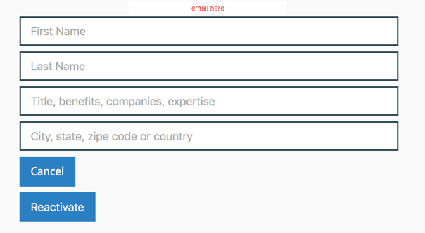
I would like to align 'Cancel' link and 'Reactivate' button side by side. I tried the following:
// style.scss
a {
  align-self: flex-start;
}
button {
  align-self: flex-end;
}
This only slides the elements to left and right respectively without being on the same line. Here is the output I wish to get:
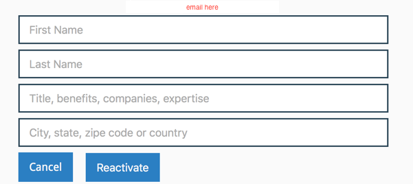
Any suggestions on how to reach my expected output?
 934
934
You can just use flex-wrap: wrap with row direction and set flex: 0 0 100% on inputs.
form {
  display: flex;
  flex-wrap: wrap;
}
input {
  flex: 0 0 100%;
}
<div class="form2">
<div class="message"></div>
<form id="updateUserForm">
<label class="userInfo"></label>
<input type="text" name="userFirstName" class="userFirstName" placeholder="First Name">
<input type="text" name="userLastName" class="userLastName" placeholder="Last Name">
<input type="text" name="subTag" class="subTag" placeholder="Title, benefits, companies, expertise">
<input type="text" name="subLocation" class="subLocation" placeholder="City, state, zipe code or country">
<a href="./manage.html" class="cancelLink">Cancel</a>
<button type="submit " class="updateButton">Lorem</button>
</form>
</div>If you love us? You can donate to us via Paypal or buy me a coffee so we can maintain and grow! Thank you!
Donate Us With

