 Menu
Menu
The question is as simple as in the title. I am trying to put a Picker which has the style of SegmentedPickerStyle to NavigationBar in SwiftUI. It is just like the native Phone application's history page. The image is below
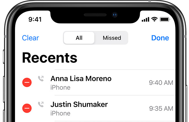
I have looked for Google and Github for example projects, libraries or any tutorials and no luck. I think if nativa apps and WhatsApp for example has it, then it should be possible. Any help would be appreciated.
 554
554
SwiftUI 2 + toolbar:
struct DemoView: View {

    @State private var mode: Int = 0

    var body: some View {
        Text("Hello, World!")
            .toolbar {
                ToolbarItem(placement: .principal) {
                    Picker("Color", selection: $mode) {
                        Text("Light").tag(0)
                        Text("Dark").tag(1)
                    }
                    .pickerStyle(SegmentedPickerStyle())
                }
            }
    }
}
You can put a Picker directly into .navigationBarItems.
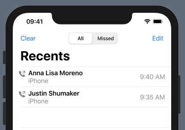
The only trouble I'm having is getting the Picker to be centered. (Just to show that a Picker can indeed be in the Navigation Bar I put together a kind of hacky solution with frame and Geometry Reader. You'll need to find a proper solution to centering.)
struct ContentView: View {
    @State private var choices = ["All", "Missed"]
    @State private var choice = 0

    @State private var contacts = [("Anna Lisa Moreno", "9:40 AM"), ("Justin Shumaker", "9:35 AM")]

    var body: some View {
        GeometryReader { geometry in
            NavigationView {
                List {
                    ForEach(self.contacts, id: \.self.0) { (contact, time) in
                        ContactView(name: contact, time: time)
                    }
                    .onDelete(perform: self.deleteItems)
                }
                .navigationBarTitle("Recents")
                .navigationBarItems(
                    leading:
                    HStack {
                        Button("Clear") {
                            // do stuff
                        }
                        Picker(selection: self.$choice, label: Text("Pick One")) {
                            ForEach(0 ..< self.choices.count) {
                                Text(self.choices[$0])
                            }
                        }
                        .frame(width: 130)
                        .pickerStyle(SegmentedPickerStyle())
                            .padding(.leading, (geometry.size.width / 2.0) - 130)
                    },
                trailing: EditButton())
            }
        }
    }

    func deleteItems(at offsets: IndexSet) {
        contacts.remove(atOffsets: offsets)
    }

}

struct ContactView: View {
    var name: String
    var time: String

    var body: some View {
        HStack {
            VStack {
                Image(systemName: "phone.fill.arrow.up.right")
                .font(.headline)
                .foregroundColor(.secondary)
                Text("")
            }
            VStack(alignment: .leading) {
                Text(self.name)
                    .font(.headline)
                Text("iPhone")
                    .foregroundColor(.secondary)
            }
            Spacer()
            Text(self.time)
                .foregroundColor(.secondary)
        }
    }
}
For those who want to make it dead center, Just put two HStack to each side and made them width fixed and equal.
Add this method to View extension.
extension View {
    func navigationBarItems<L, C, T>(leading: L, center: C, trailing: T) -> some View where L: View, C: View, T: View {
        self.navigationBarItems(leading:
            HStack{
                HStack {
                    leading
                }
                .frame(width: 60, alignment: .leading)
                Spacer()
                HStack {
                    center
                }
                 .frame(width: 300, alignment: .center)
                Spacer()
                HStack {
                    //Text("asdasd")
                    trailing
                }
                //.background(Color.blue)
                .frame(width: 100, alignment: .trailing)
            }
            //.background(Color.yellow)
            .frame(width: UIScreen.main.bounds.size.width-32)
        )
    }
}
Now you have a View modifier which has the same usage of navigationBatItems(:_). You can edit the code based on your needs.
Usage example:
.navigationBarItems(leading: EmptyView(), center:
    Picker(selection: self.$choice, label: Text("Pick One")) {
        ForEach(0 ..< self.choices.count) {
             Text(self.choices[$0])
        }
     }
    .pickerStyle(SegmentedPickerStyle())
}, trailing: EmptyView())
UPDATE
There was the issue of leading and trailing items were violating UINavigationBarContentView's safeArea. While I was searching through, I came across another solution in this answer. It is little helper library called SwiftUIX. If you do not want install whole library -like me- I created a gist just for navigationBarItems. Just add the file to your project.
But do not forget this, It was stretching the Picker to cover all the free space and forcing StatusView to be narrower. So I had to set frames like this;
.navigationBarItems(center:
    Picker(...) {
        ...
    }
    .frame(width: 150)
, trailing:
    StatusView()
    .frame(width: 70)
)
Simple answer how to center segment controller and hide one of the buttons.
@State var showLeadingButton = true
    var body: some View {
        HStack {
            Button(action: {}, label: {"leading"})
                          .opacity(showLeadingButton ? true : false)


            Spacer()

            Picker(selection: $selectedStatus,
                   label: Text("SEGMENT") {
                segmentValues
                }
             .id(UUID())
             .pickerStyle(SegmentedPickerStyle())
             .fixedSize()

             Spacer()
             Button(action: {}, label: {"trailing"})
        }
        .frame(width: UIScreen.main.bounds.width)
    }
If you love us? You can donate to us via Paypal or buy me a coffee so we can maintain and grow! Thank you!
Donate Us With