 Menu
Menu
Add a background drawable that references to an image, or a selector (like below), and make the button transparent:
<RadioButton
    android:id="@+id/radio0"
    android:layout_width="wrap_content"
    android:layout_height="wrap_content"
    android:background="@null"
    android:button="@drawable/yourbuttonbackground"
    android:checked="true"
    android:text="RadioButton1" />
If you would like your radio buttons to have a different resource when checked, create a selector background drawable:
res/drawable/yourbuttonbackground.xml
<selector xmlns:android="http://schemas.android.com/apk/res/android" >
    <item
        android:drawable="@drawable/b"
        android:state_checked="true"
        android:state_pressed="true" />
    <item
        android:drawable="@drawable/a"
        android:state_pressed="true" />
    <item
        android:drawable="@drawable/a"
        android:state_checked="true" />
    <item
        android:drawable="@drawable/b" />
</selector>
In the selector above, we reference two drawables, a and b, here's how we create them:
res/drawable/a.xml - Selected State
<shape
    xmlns:android="http://schemas.android.com/apk/res/android"
    android:shape="rectangle" >
    <corners
        android:radius="5dp" />
    <solid
        android:color="#fff" />
    <stroke
        android:width="2dp"
        android:color="#53aade" />
</shape>
res/drawable/b.xml - Regular State
<shape
    xmlns:android="http://schemas.android.com/apk/res/android"
    android:shape="rectangle" >
    <corners
        android:radius="5dp" />
    <solid
        android:color="#fff" />
    <stroke
        android:width="2dp"
        android:color="#555555" />
</shape>
More on drawables here: http://developer.android.com/guide/topics/resources/drawable-resource.html
I have updated accepted answer and removed unnecessary things.
I have created XML for following image.
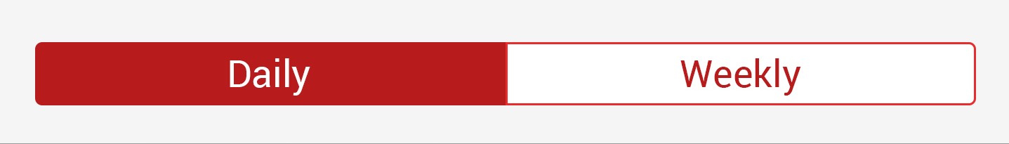
Your XML code for RadioButton will be:
<RadioGroup
        android:id="@+id/daily_weekly_button_view"
        android:layout_width="match_parent"
        android:layout_height="wrap_content"
        android:layout_marginStart="8dp"
        android:layout_marginLeft="8dp"
        android:layout_marginTop="8dp"
        android:layout_marginEnd="8dp"
        android:layout_marginRight="8dp"
        android:gravity="center_horizontal"
        android:orientation="horizontal"
        app:layout_constraintEnd_toEndOf="parent"
        app:layout_constraintStart_toStartOf="parent"
        app:layout_constraintTop_toTopOf="parent">


        <RadioButton
            android:id="@+id/radio0"
            android:layout_width="@dimen/_80sdp"
            android:gravity="center"
            android:layout_height="wrap_content"
            android:background="@drawable/radio_flat_selector"
            android:button="@android:color/transparent"
            android:checked="true"
            android:paddingLeft="@dimen/_16sdp"
            android:paddingTop="@dimen/_3sdp"
            android:paddingRight="@dimen/_16sdp"
            android:paddingBottom="@dimen/_3sdp"
            android:text="Daily"
            android:textColor="@color/radio_flat_text_selector" />

        <RadioButton
            android:id="@+id/radio1"
            android:gravity="center"
            android:layout_width="@dimen/_80sdp"
            android:layout_height="wrap_content"
            android:background="@drawable/radio_flat_selector"
            android:button="@android:color/transparent"
            android:paddingLeft="@dimen/_16sdp"
            android:paddingTop="@dimen/_3sdp"
            android:paddingRight="@dimen/_16sdp"
            android:paddingBottom="@dimen/_3sdp"
            android:text="Weekly"
            android:textColor="@color/radio_flat_text_selector" />

</RadioGroup>
radio_flat_selector.xml for background selector:<?xml version="1.0" encoding="utf-8"?>
<selector xmlns:android="http://schemas.android.com/apk/res/android">
<item android:drawable="@drawable/radio_flat_selected" android:state_checked="true" />
<item android:drawable="@drawable/radio_flat_regular" />
</selector>
radio_flat_selected.xml for selected button:<?xml version="1.0" encoding="utf-8"?>
<shape xmlns:android="http://schemas.android.com/apk/res/android"
android:shape="rectangle">
<corners
android:radius="1dp"
/>
<solid android:color="@color/colorAccent" />
<stroke
android:width="1dp"
android:color="@color/colorAccent" />
</shape>
radio_flat_regular.xml for regular selector:<?xml version="1.0" encoding="utf-8"?>
<shape xmlns:android="http://schemas.android.com/apk/res/android"
android:shape="rectangle">
<corners android:radius="1dp" />
<solid android:color="#fff" />
<stroke
android:width="1dp"
android:color="@color/colorAccent" />
</shape>
All the above 3 file code will be in drawable/ folder.
Now we also need Text Color Selector to change color of text accordingly.
radio_flat_text_selector.xml for text color selector(Use color/ folder for this file.)
<?xml version="1.0" encoding="utf-8"?>
<selector xmlns:android="http://schemas.android.com/apk/res/android">
    <item android:color="@color/colorAccent" android:state_checked="false" />
    <item android:color="@color/colorWhite" android:state_checked="true" />
</selector>
Note: I refereed many answers for this type of solution but didn't found good solution so I make it.
Hope it will be helpful to you.
Thanks.
Use the same XML file format from Evan's answer, but one drawable file is all you need for formatting.
<RadioButton
    android:id="@+id/radio0"
    android:layout_width="wrap_content"
    android:layout_height="wrap_content"
    android:background="@drawable/custom_button_background"
    android:button="@android:color/transparent"
    android:checked="true"
    android:text="RadioButton1" />
And your separate drawable file:
<?xml version="1.0" encoding="utf-8"?>
<selector xmlns:android="http://schemas.android.com/apk/res/android" >

    <item android:state_pressed="true" >
         <shape android:shape="rectangle" >
             <corners android:radius="3dip" />
             <stroke android:width="1dip" android:color="#333333" />
             <solid android:color="#cccccc" />
         </shape>
    </item>

    <item android:state_checked="true">
         <shape android:shape="rectangle" >
             <corners android:radius="3dip" />
             <stroke android:width="1dip" android:color="#333333" />
             <solid android:color="#cccccc" />
         </shape>
    </item>

    <item>
         <shape android:shape="rectangle"  >
             <corners android:radius="3dip" />
             <stroke android:width="1dip" android:color="#cccccc" />
             <solid android:color="#ffffff" />
         </shape>
    </item>
</selector>
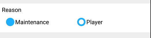
Setting android:background and android:button of the RadioButton like the accepted answer didn't work for me. The drawable image was being displayed as a background(eventhough android:button was being set to transparent ) to the radio button text as 
android:background="@drawable/radiobuttonstyle"
    android:button="@android:color/transparent"
so gave radiobutton as the custom drawable radiobuttonstyle.xml
<RadioButton
    android:layout_width="wrap_content"
    android:layout_height="wrap_content"
    android:checked="true"
    android:text="Maintenance"
    android:id="@+id/radioButton1"
    android:button="@drawable/radiobuttonstyle"
      />
and radiobuttonstyle.xml is as follows
<?xml version="1.0" encoding="utf-8" ?>
<selector xmlns:android="http://schemas.android.com/apk/res/android">
  <item android:state_checked="true" android:drawable="@drawable/ic_radio_checked"></item>
  <item android:state_checked="false" android:drawable="@drawable/ic_radio_unchecked"></item>
</selector>
and after this radiobutton with custom button style worked.
You must fill the "Button" attribute of the "CompoundButton" class with a XML drawable path (my_checkbox). In the XML drawable, you must have :
<?xml version="1.0" encoding="utf-8"?>
<selector xmlns:android="http://schemas.android.com/apk/res/android" >
    <item android:state_checked="false" android:drawable="@drawable/checkbox_not_checked" />
     <item android:state_checked="true" android:drawable="@drawable/checkbox_checked" />
     <item android:drawable="@drawable/checkbox_not_checked" /> <!-- default -->
</selector>
Don't forget to replace my_checkbox by your filename of the checkbox drawable , checkbox_not_checked by your PNG drawable which is your checkbox when it's not checked and checkbox_checked with your image when it's checked.
For the size, directly update the layout parameters.
In order to hide the default radio button, I'd suggest to remove the button instead of making it transparent as all visual feedback is handled by the drawable background :
android:button="@null"
Also it would be better to use styles as there are several radio buttons :
<RadioButton style="@style/RadioButtonStyle" ... />

<style name="RadioButtonStyle" parent="@android:style/Widget.CompoundButton">
    <item name="android:background">@drawable/customButtonBackground</item>
    <item name="android:button">@null</item>
</style>
You'll need the Seslyn customButtonBackground drawable too.
Best way to add custom drawable is:
<RadioButton
    android:id="@+id/radiocar"
    android:layout_width="wrap_content"
    android:layout_height="wrap_content"
    android:layout_gravity="center"
    android:background="@android:color/transparent"
    android:button="@drawable/yourbuttonbackground"
    android:checked="true"
    android:drawableRight="@mipmap/car"
    android:paddingLeft="5dp"
    android:paddingRight="5dp"
    android:text="yourtexthere"/>
Shadow overlay by custom drawable is removed here.
If you love us? You can donate to us via Paypal or buy me a coffee so we can maintain and grow! Thank you!
Donate Us With