 Menu
Menu
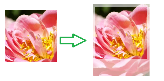
I would like to add an opacity on the clip-path/clip (the area covered by the clip path) like the picture shown below.
Below is my code for the same
.item--clip .demo {
  width: 200px;
  height: 250px;
}

.item--clip .has-mask {
  position: absolute;
  clip: rect(10px, 190px, 190px, 10px);
}


/* Common ------------------------------------------- */

.item {
  position: relative;
  margin-bottom: 2em;
  padding-bottom: 2em;
  padding-right: 3em;
  border-bottom: 1px solid #DDD;
  /* counter-increment: mylist; */
}

.item::before {
  /* // content: counter(mylist); */
  position: absolute;
  right: 0;
  top: 0;
  font: 2rem/1 Georgia, serif;
  color: #EEE;
}

.item::after {
  content: '';
  display: table;
  width: 100%;
}

.demo {
  position: relative;
  float: left;
  margin-right: 30px;
}

.demo::before {
  content: '';
  display: block;
  position: absolute;
  z-index: -2;
  top: 0;
  right: 0;
  bottom: 0;
  left: 0;
  opacity: 0;
  transition: .7s;
}

.text {
  padding-left: 230px;
}

.item:hover ::before {
  opacity: .4;
}
<div class="wrapper">
<div class="item item--clip">
<div class="demo">
<img src="https://img-fotki.yandex.ru/get/5607/5091629.6b/0_612e6_b9039c0d_M.jpg" alt="" class="has-mask" />
</div>
</div>
</div> 338
338
This is the purpose of mask:
img {
  width: 200px;
  height: 250px;
  -webkit-mask:
    /*                        X    Y   / wwidth height */
    linear-gradient(#000 0 0) 10px 10px/170px 170px, /* control the clipped part here*/
    linear-gradient(rgba(0,0,0,0.4) 0 0); /* control the opacity here */
  -webkit-mask-repeat:no-repeat;
}
<img src="https://img-fotki.yandex.ru/get/5607/5091629.6b/0_612e6_b9039c0d_M.jpg" />If you love us? You can donate to us via Paypal or buy me a coffee so we can maintain and grow! Thank you!
Donate Us With

