 Menu
Menu
I'm trying to mimic the effect as shown here:
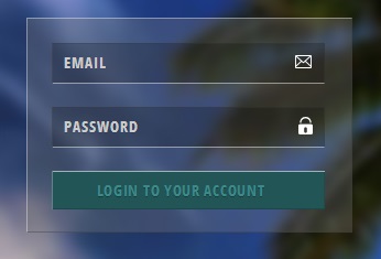
The border at the top and left of the box is giving it a nice embossed effect. I tried the same with the following:
<!-- HTML -->
<div id="nl-login">
</div>

<!-- CSS -->
*{
    margin:0;
    padding:0;
}
html{
    width:100%;
    height:100%;
}
body{
    background-color:#3E4C79;
    width:100%;
    height:100%;
}
#nl-login{
    width:400px;
    height:250px;
    background-color:#f0f0f0;
    margin:40px auto;
    opacity:0.3;
    box-shadow:-1px -1px 2px #fff;
    border:1px solid #fff;
}
But it's not even close to it. I think it has got to do with having a better pair of border and box-shadow values which I can't seem to zero in on. Any help?
Here is a fiddle just in case.
 210
210
You're using opacity: 0.3; here which affects the entire element as well as its children. The correct approach would be to use an rgba() background color, along with rgba() for the border color. Also removing the right and bottom borders produces the desired result (at least a close approximation)
#nl-login{
    width:400px;
    height:250px;
    background-color:rgba(255, 255, 255, .3);
    margin:40px auto;
    /*box-shadow:-1px -1px 2px #fff;*/
    border:1px solid rgba(255, 255, 255, .7);
  border-right-width: 0;
  border-bottom-width: 0;
}
https://jsfiddle.net/Kyle_Sevenoaks/3mjeLo00/1/
117
I like to use two comma separated box-shadows:
box-shadow: inset -1px -1px 1px 0px rgba(0, 0, 0, 0.4), inset 1px 1px 1px 0px rgba(255, 255, 255, 0.4);
As in this fiddle.
It makes sense to me to use shadows as we are creating light effects. Plus this technique allows blur / spread, and leaves the border and outline attributes available if you want to use them for other effects.
38
Do not make the whole element semi-transparent (as that will affect all descendant elements). Use alpha on the background color.
And you can also make the borders semi transparent (without using any shadow).
#nl-login{
    width:400px;
    height:250px;
    background-color:rgba(240,240,240,0.3);
    margin:40px auto;
    border:1px solid;
    border-color:rgba(240,240,240,0.5) /*top border*/
               rgba(0,0,0,0.5)  /*right border*/
               rgba(0,0,0,0.5) /*bottom border*/
               rgba(240,240,240,0.5) /*left border*/;
}
Full example
* {
  margin: 0;
  padding: 0;
}
html {
  width: 100%;
  height: 100%;
}
body {
  background-color: #3E4C79;
  width: 100%;
  height: 100%;
}
#nl-login {
  width: 400px;
  height: 250px;
  background-color: rgba(240, 240, 240, 0.3);
  margin: 40px auto;
  border: 1px solid;
  border-color: rgba(240, 240, 240, 0.5)
                rgba(0, 0, 0, 0.5)
                rgba(0, 0, 0, 0.5)
                rgba(240, 240, 240, 0.5);
}
<div id="nl-login">
</div>If you love us? You can donate to us via Paypal or buy me a coffee so we can maintain and grow! Thank you!
Donate Us With