 Menu
Menu
3D transform in Firefox seems to have issues with z-index. It seems to me that the rendering is "ignoring" the 3D Z position, and simply uses the z-index from DOM. Interesting enough, when the visible portion is made smaller, so that only a part of the wheel is visible, the z-index is suddenly correct, although other artifacts start to appear.
There is this intersection bug demonstration which is bugged since 2011 in Firefox, but my circles are not intersecting - so I hope it is somehow possible. http://jsfiddle.net/yNfQX/21/
Firefox Bugtracker: https://bugzilla.mozilla.org/show_bug.cgi?id=689498
.perspective {
  width: 400px;
  height: 400px;
  position: relative;
  perspective: 3000px;
  display: block;
}
.dcw {
  width: 100%;
  height: 100%;
  position: absolute;
  transform-style: preserve-3d;
}
.dc {
  top: calc(50% - 44px);
  left: calc(50% - 44px);
  margin: auto;
  border-radius: 50%;
  position: absolute;
  cursor: pointer;
  transform-style: preserve-3d;
  width: 88px;
  height: 88px;
  border: 1px solid black;
}
<div class="perspective">
<div class="dcw">
<div class="dc" style="background-color: rgba(255,0,0,1);transform: rotateZ( 0deg ) translateX(125px) rotateX( -60deg ); "></div>
<div class="dc" style="background-color: rgba(251,4,4,1);transform: rotateZ( 10deg ) translateX(125px) rotateX( -60deg ); "></div>
<div class="dc" style="background-color: rgba(248,7,7,1);transform: rotateZ( 20deg ) translateX(125px) rotateX( -60deg ); "></div>
<div class="dc" style="background-color: rgba(244,11,11,1);transform: rotateZ( 30deg ) translateX(125px) rotateX( -60deg ); "></div>
<div class="dc" style="background-color: rgba(241,14,14,1);transform: rotateZ( 40deg ) translateX(125px) rotateX( -60deg ); "></div>
<div class="dc" style="background-color: rgba(237,18,18,1);transform: rotateZ( 50deg ) translateX(125px) rotateX( -60deg ); "></div>
<div class="dc" style="background-color: rgba(234,21,21,1);transform: rotateZ( 60deg ) translateX(125px) rotateX( -60deg ); "></div>
<div class="dc" style="background-color: rgba(230,25,25,1);transform: rotateZ( 70deg ) translateX(125px) rotateX( -60deg ); "></div>
<div class="dc" style="background-color: rgba(227,28,28,1);transform: rotateZ( 80deg ) translateX(125px) rotateX( -60deg ); "></div>
<div class="dc" style="background-color: rgba(223,32,32,1);transform: rotateZ( 90deg ) translateX(125px) rotateX( -60deg ); "></div>
<div class="dc" style="background-color: rgba(219,36,36,1);transform: rotateZ( 100deg ) translateX(125px) rotateX( -60deg ); "></div>
<div class="dc" style="background-color: rgba(216,39,39,1);transform: rotateZ( 110deg ) translateX(125px) rotateX( -60deg ); "></div>
<div class="dc" style="background-color: rgba(212,43,43,1);transform: rotateZ( 120deg ) translateX(125px) rotateX( -60deg ); "></div>
<div class="dc" style="background-color: rgba(209,46,46,1);transform: rotateZ( 130deg ) translateX(125px) rotateX( -60deg ); "></div>
<div class="dc" style="background-color: rgba(205,50,50,1);transform: rotateZ( 140deg ) translateX(125px) rotateX( -60deg ); "></div>
<div class="dc" style="background-color: rgba(202,53,53,1);transform: rotateZ( 150deg ) translateX(125px) rotateX( -60deg ); "></div>
<div class="dc" style="background-color: rgba(198,57,57,1);transform: rotateZ( 160deg ) translateX(125px) rotateX( -60deg ); "></div>
<div class="dc" style="background-color: rgba(195,60,60,1);transform: rotateZ( 170deg ) translateX(125px) rotateX( -60deg ); "></div>
<div class="dc" style="background-color: rgba(191,64,64,1);transform: rotateZ( 180deg ) translateX(125px) rotateX( -60deg ); "></div>
<div class="dc" style="background-color: rgba(187,68,68,1);transform: rotateZ( 190deg ) translateX(125px) rotateX( -60deg ); "></div>
<div class="dc" style="background-color: rgba(184,71,71,1);transform: rotateZ( 200deg ) translateX(125px) rotateX( -60deg ); "></div>
<div class="dc" style="background-color: rgba(180,75,75,1);transform: rotateZ( 210deg ) translateX(125px) rotateX( -60deg ); "></div>
<div class="dc" style="background-color: rgba(177,78,78,1);transform: rotateZ( 220deg ) translateX(125px) rotateX( -60deg ); "></div>
<div class="dc" style="background-color: rgba(173,82,82,1);transform: rotateZ( 230deg ) translateX(125px) rotateX( -60deg ); "></div>
<div class="dc" style="background-color: rgba(170,85,85,1);transform: rotateZ( 240deg ) translateX(125px) rotateX( -60deg ); "></div>
<div class="dc" style="background-color: rgba(166,89,89,1);transform: rotateZ( 250deg ) translateX(125px) rotateX( -60deg ); "></div>
<div class="dc" style="background-color: rgba(163,92,92,1);transform: rotateZ( 260deg ) translateX(125px) rotateX( -60deg ); "></div>
<div class="dc" style="background-color: rgba(159,96,96,1);transform: rotateZ( 270deg ) translateX(125px) rotateX( -60deg ); "></div>
<div class="dc" style="background-color: rgba(155,100,100,1);transform: rotateZ( 280deg ) translateX(125px) rotateX( -60deg ); "></div>
<div class="dc" style="background-color: rgba(152,103,103,1);transform: rotateZ( 290deg ) translateX(125px) rotateX( -60deg ); "></div>
<div class="dc" style="background-color: rgba(148,107,107,1);transform: rotateZ( 300deg ) translateX(125px) rotateX( -60deg ); "></div>
<div class="dc" style="background-color: rgba(145,110,110,1);transform: rotateZ( 310deg ) translateX(125px) rotateX( -60deg ); "></div>
<div class="dc" style="background-color: rgba(141,114,114,1);transform: rotateZ( 320deg ) translateX(125px) rotateX( -60deg ); "></div>
<div class="dc" style="background-color: rgba(138,117,117,1);transform: rotateZ( 330deg ) translateX(125px) rotateX( -60deg ); "></div>
<div class="dc" style="background-color: rgba(134,121,121,1);transform: rotateZ( 340deg ) translateX(125px) rotateX( -60deg ); "></div>
<div class="dc" style="background-color: rgba(131,124,124,1);transform: rotateZ( 350deg ) translateX(125px) rotateX( -60deg ); "></div>
</div>
</div>JSFiddle of it: https://jsfiddle.net/gvquf0g6/
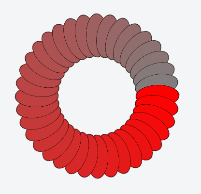
How it should look like (screenshot from Chrome):
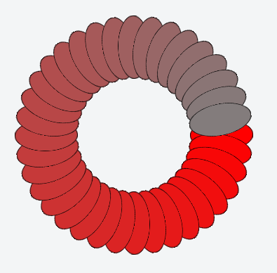
z-index issue (screenshot from Firefox):
Artifact issue, and working z-index with partial visible wheel (screenshot from Firefox):
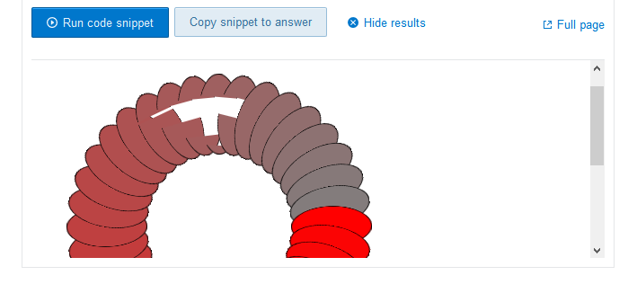

Moving your mouse over the artifacts (missing blocks) fills them in as they should be when first rendered.
 319
319
Unfortunately, z-ordering is not working fine with cycled layers. It is a known problem that Firefox doesn't handle at all currently. That's an old Firefox bug and you can't fix it until they fix the bug in the browser.
57
In the meantime I found a solution, yet its not what I wanted and it ain't perfect either, there appear artifacts and animating it with transition gives many issues. But as a static "image" it seems to work.
Basically the circle is drawn twice, once for the blue half and once for the green half, but just a half of it is visible.
In Chrome its broken, could be solved... but I did care only about firefox. (And this was really quick and dirty coding, I just looked over it again, and noticed double declared function drawCircle2 ...) https://jsfiddle.net/7w31uLsL/
$dcw = $(".dcw");
var newElement;
var center = 300;
var distance = 200,
  color;
for (var i = 0; i < 360; i = i + 10) {
  color = 20 + Math.round((128 / 360) * i);
  color2 = 220 - Math.round((128 / 360) * i);

  $(drawCircle2(color,color2,i,distance)).appendTo($dcw);
}

function drawCircle2(color,color2,rotation,distance) {
	return '<div class="circle" style="transform: translate3d(0,0,0) rotateZ( ' + rotation + 'deg ) translateX('+distance+'px) rotateX(10deg );">' +
  '<div style="background-color: rgba(' + color + ',0,0,1);"></div>' +
  '<div style="background-color: rgba(' + color + ',0,0,1);"></div>' +
 '</div>';
}

function drawCircle2(color,color2,rotation,distance) {
	return '<div class="circle2" style="background-color: rgba(' + color + ',0,0,1);transform: translate3d(0,0,0) rotateZ( ' + rotation + 'deg ) translateX('+distance+'px) rotateX(10deg );">' +
 '</div>';
}
.color-wheel {
width: 600px;
height: 600px;
position: relative;
perspective: 3000px;
display: block;
}
.dcw {
top: 0;
bottom:0;
height: 100%;
width: 50%;
position: absolute;
transform-style: preserve-3d;
overflow:hidden;
}
.dcw:first-child {
right:50%;
left:0;
}
.dcw:last-child {
right:0;
left:50%;
}
.dcw:first-child .circle2 {
left: calc(100% - 94px);
}
.dcw:last-child .circle2 {
left: calc(0% - 94px);
}
.circle2 {
top: calc(50% - 94px);
margin: auto;
position: absolute;
cursor: pointer;
transform-style: preserve-3d;
width: 188px;
height: 188px;
border-radius:50%;
border:1px solid black;
}
.circle {
top: calc(50% - 94px);
margin: auto;
position: absolute;
cursor: pointer;
transform-style: preserve-3d;
width: 188px;
height: 188px;
border-radius:50%;
border:1px solid black;
}
.circle div {
left:0;
right:0;
position: absolute;
transform-style: preserve-3d;
width: 100%;
height: 50%;
}
.circle div:first-child {
border-top-left-radius:1000px;
border-top-right-radius:1000px;
top: 0;
bottom:50%
}
.circle div:last-child {
border-bottom-left-radius:1000px;
border-bottom-right-radius:1000px;
bottom: 0;
top:50%;
}<script type="text/javascript" src="//code.jquery.com/jquery-git.js"></script>
<div class="color-wheel">
<div class="dcw" style="background-color:blue;">
</div>
<div class="dcw" style="background-color:green;">
</div>
</div>If you love us? You can donate to us via Paypal or buy me a coffee so we can maintain and grow! Thank you!
Donate Us With