 Menu
Menu
Can anyone assist me with the following div layout? I have tried a couple of solutions, however, the only way i have been able to accomplish this is using tables.
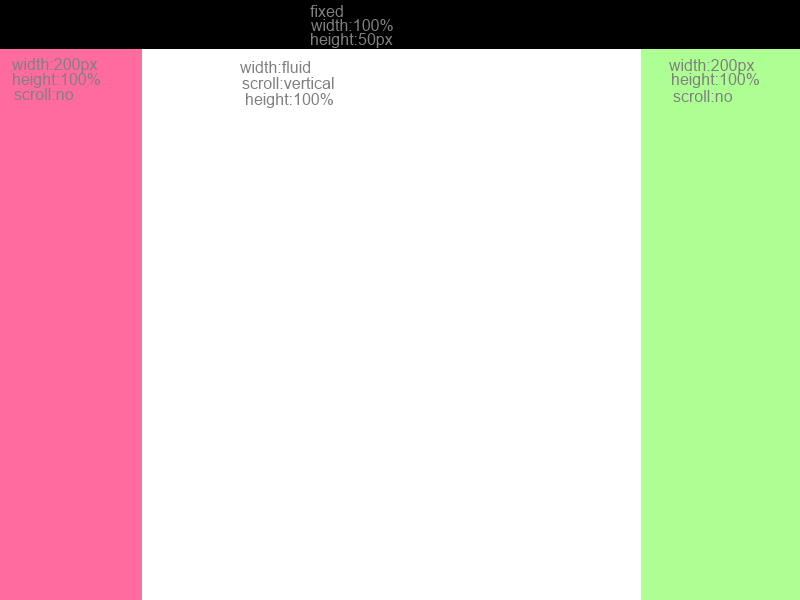
I had a look at Holy Grail 3 Column Layout, however, this layoyt is not 100% height, and header is not fixed, i also need only the content to scroll, the sidebars needs to be fixed 100% height
 333
333
It seems the answers here ignored most of your requirements. I stumbled upon this because I am having a rendering issue with the same layout you are after. I forked the fiddle above to show you:
http://jsfiddle.net/RsRf9/2/
The major difference is that the entire body is scrollable, not just the tiny area in the center (I think this is what you are after).
Aside from cleaning up styles that weren't doing anything (like floats while position fixed), the major change is to the center col - all you should need is this:
.center{margin:100px 200px;}
The other change is how you get that "height 100%" effect on your sidebars - my trick is to do this:
.left,.right{width:200px;top: 100px; bottom: 0px;position: fixed;}
Instead of height 100%, I simply tell it to stretch from top 100 (the bottom of the nav) to bottom 0 (the bottom of the page)
That will push the content bellow the top nav and in between your two fixed side bars.
171
I have created a working fiddle as per your requirements:
Here is working fiddle - UPDATED to include fixed header ONLY TOP BAR IS FIXED
The important thing to note is the structural layout of the divs... notice that the .center is AFTER the .right
<div class='wrap'>
    <div class='head'>Header</div>
    <div class='bodywrap'>
        <div class='left'>left</div>
        <div class='right'>right</div>
        <div class='center'>center center center center center center center center center center center center ... blah</div>
    </div>
 </div>
and the css is:
JUST HEADER FIXED:
html,body{height:100%}
.wrap{width:100%;height:100%;position:relative}
.head{height:100px;position:fixed;top:0;left:0;width:100%} << UPDATED for fixed header
.bodywrap{margin-top:100px;width:102%;margin-left:-1%} << UPDATED - Terrible hack and you may find something more elegant
.left,.right{width:200px;height:100%}
.left,.center,.right,.bodywrap{height:100%}
.left{float:left;}
.center{margin-left:200px; overflow:scroll; overflow-x:hidden;}
.right{float:right;}

.left{background-color:#aaa}
.right{background-color:#ccc}
.center{background-color:#444}
.head{background-color:#777}
HEADER AND SIDEBARS FIXED (Also was able to fix dirty hack for .left and .right undersizing
html,body{height:100%}
.wrap{width:100%;height:100%;position:relative}
.head{height:100px;position:fixed;top:0;left:0;width:100%}
.bodywrap{margin-top:100px;margin-left:-8px}
.left,.right{width:200px;height:100%}
.left,.center,.right,.bodywrap{height:100%}
.left{float:left;position:fixed}
.center{margin-left:200px; overflow:scroll; overflow-x:hidden;margin-right:191px}
.right{position:fixed;right:0}

.left{background-color:#aaa}
.right{background-color:#ccc}
.center{background-color:#444}
.head{background-color:#777}
Here is with top and sides fixed center scroll liquid center column (and no gaps on .left and .right)
It's basic use of floats but the structural markup layout is key ;)
22
If you love us? You can donate to us via Paypal or buy me a coffee so we can maintain and grow! Thank you!
Donate Us With