 Menu
Menu
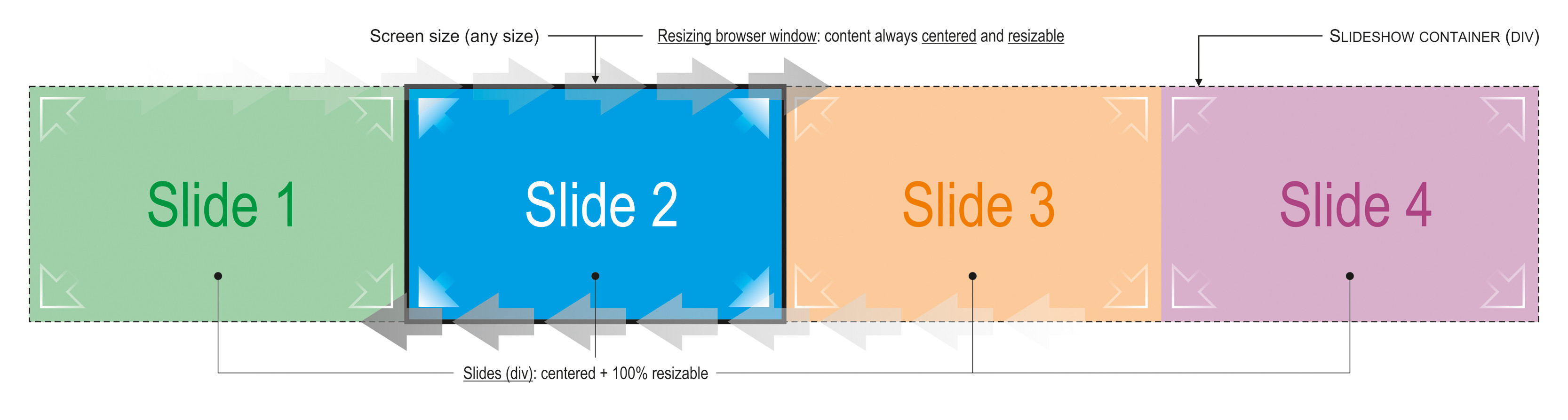
Is it possible to have a container div with X child divs, each one 100% resizable in the browser? I know it can be done with a single background, but not with a row of divs... This is what I intend to do (slideshow that slides left/right):
The HTML:
<div id="slideshowContent">
  <div id="slideshowImage_01" class="slideshowImage_container"></div>
  <div id="slideshowImage_02" class="slideshowImage_container"></div>
  <div id="slideshowImage_03" class="slideshowImage_container"></div>
  <div id="slideshowImage_04" class="slideshowImage_container"></div>
</div> <!-- End of id="slideshowContent" -->
... and the CSS:
#slideshowContainer {
  z-index: 0;
  width: 11520px; height: 1080px;
  position: relative;
}

.slideshowImage {
  width: 1920px; height: 1080px;
  float: left;
}
Thanx.
Pedro
EDIT 1: I forgot to mention that each individual div contains an image.
EDIT 2: Added my own updated FIDDLE.
 883
883
Here's fully working version: http://jsfiddle.net/y9zcf/7/
The centering is done using CSS, the javascript is just to run the slideshow.
HTML:
<div id="slideshowWrapper">
    <div id="slideshowContent">
        <div id="slideshowImage_01" class="slideshowImage_container active"></div>
        <div id="slideshowImage_02" class="slideshowImage_container"></div>
        <div id="slideshowImage_03" class="slideshowImage_container"></div>
        <div id="slideshowImage_04" class="slideshowImage_container"></div>
    </div>
</div>
CSS:
body, html {
    height: 100%;
    margin: 0;
}
#slideshowWrapper {
    overflow: hidden;
    width: 100%;
    height: 100%;
}
#slideshowContent {
    width: 400%; // 100% * number of slides
    height: 100%;
    position: relative;
}
#slideshowContent .slideshowImage_container {
    width: 25%; // 100% / number of slides
    height: 100%;
    float: left;
}
JS:
function slide() {
    var container = $('#slideshowContent'),
        nextDiv = container.find('.active').next('div'),
        slides = container.find('div'),
        next = nextDiv.length ? nextDiv : slides.first();

    slides.removeClass('active');
    next.addClass('active');
    $('#slideshowContent').animate({
        'left': '-' + next.index() * next.width() + 'px'
    }, 2000, function () {
        $(this).css({
            'left': '-' + next.index() * 100 + '%'
        });
    });

}

setInterval(function () {
    slide();
}, 5000);
This is 100% resizable and #slideshowWrapper can be set to any width/height and the divs inside will work fine. Setting the CSS to a percent value after animating means that the divs are still resizable after the transition.
99
If you love us? You can donate to us via Paypal or buy me a coffee so we can maintain and grow! Thank you!
Donate Us With

