I have two sets of data points that both relate to the same primary axis, but who differ in secondary axis. Is there some way to plot them on top of each other in R using ggplot2?
What I am looking for is basically something that looks like this:
4+           |
 | x       . + 220
3+     . .   |
 |   x       |
2+   .       + 210
 |     x     |
1+ .     x x |
 |           + 200
0+-+-+-+-+-+-+
     time

   . temperatur
   x car sale
(This is just a example of possible data)
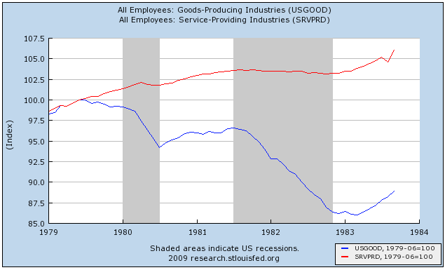
Shane's answer, "you can't in ggplot2," is correct, if incomplete. Arguably, it's not something you want to do. How do you decide how to scale the Y axis? Do you want the means of the lines to be the same? The range? There's no principled way of doing it, and it's too easy to make the results look like anything you want them to look like. Instead, what you might want to do, especially in a time-series like that, is to norm the two lines of data so that at a particular value of t, often min(t), Y1 = Y2 = 100. Here's an example I pulled off of the Bonddad Blog (not using ggplot2, which is why it's ugly!) But you can cleanly tell the relative increase and decrease of the two lines, which have completely different underlying scales.
If you love us? You can donate to us via Paypal or buy me a coffee so we can maintain and grow! Thank you!
Donate Us With