 Menu
Menu
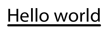
Can you make round cap underlines (as in the above image) with CSS? How?
Is there a way to do this with border-bottom? border-radius produces this stylish effect instead:

 421
421
EDIT: I missunderstood what hpique wated, but this should work:
#test {
  font-size: 50px;
  background: transparent;
  border-radius: 10px;
  height: 10px;
  width: 255px;
  box-shadow: 0 55px 0 0 #000;
  font-family: sans-serif;
}
<div id="test">Hello world</div>Basically I'm putting the text on a div, and the box shadow will be of the same size as the set height and width for that div, just play with the height/width and you should get what you want...
JSBin Demo
Screenshot from the Demo:

160
Yes, it’s possible. Add a block element using :after with no content and give it desired width/height like so:
h1:after {
  content:"";
  float:left;
  background:green;
  width:100%;
  height:6px;
  border-radius: 3px;
}
Fiddle here: https://jsfiddle.net/toqL0agq/1/
8
I tried doing this same thing with the accepted answer, but found I was still getting the undesired result shown in the question. You can achieve this with a psuedo class:
HTML:
<span class="kicker">Hello World</span>
CSS:
.kicker {
font-size: 1rem;
position: relative;

&:after {
    content: '';
    display: block;
    width: 100%;
    height: 6px;
    border-radius: 6px;
    background: #000;
    position: absolute;
    bottom: 0;
    left: 0;
}
}
4
One of the tricks i just learned is instead of working with div borders try adding an :after selector to the heading like :
h1:after{
  content: " ";
  display: block;
  width: 1.5em;
  height: .2em;
  background-color: #f0860c;
  border-radius: 10px;
}
<!DOCTYPE html>
<html>
<head>
</head>
<body>
<h1>test</h1>
</body>
</html>If you love us? You can donate to us via Paypal or buy me a coffee so we can maintain and grow! Thank you!
Donate Us With