 Menu
Menu
In the following example I'm using a text field with type='search'.
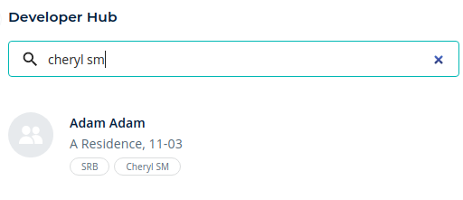
The 'clear' icon appears automatically. How can I change the styling of this icon or replace it with my own icon?
import SearchIcon from '@material-ui/icons/Search';

<TextField
   placeholder="Search"
   type="search"
   variant="outlined"
   fullWidth
   size="small"
   onChange={handleSearchFieldOnChange}
   InputProps={{
       startAdornment: (
           <InputAdornment position="start">
              <SearchIcon />
           </InputAdornment>
            ),
         }}
 />
 931
931
you can do something like this:
import InputAdornment from "@material-ui/core/InputAdornment";
import TextField from "@material-ui/core/TextField";
import SearchIcon from "@material-ui/icons/Search";
import { IconButton } from "@material-ui/core";
import CancelRoundedIcon from '@material-ui/icons/CancelRounded'
export default function InputWithIcon() {
  const [value, setValue] = useState("");

  return (
    <TextField
      placeholder="Search"
      type="text"
      variant="outlined"
      fullWidth
      size="small"
      onChange={(e) => setValue(e.target.value)}
      value={value}
      InputProps={{
        startAdornment: (
          <InputAdornment position="start">
            <SearchIcon />
          </InputAdornment>
        ),

        endAdornment: value && (
          <IconButton
            aria-label="toggle password visibility"
            onClick={() => setValue("")}
          ><CancelRoundedIcon/></IconButton>
        )
      }}
    />
  );
}
see the sandbox
178
 answered Nov 30 '25 23:11
We can use IconButton to place the clear event. Whenever we have value the clear icon is visible, otherwise it will be disable
Example:
   <TextField
      placeholder="Search"
      type="text"
      variant="outlined"
      fullWidth
      size="small"
      onChange={(e) => setValue(e.target.value)}
      value={value}
      InputProps={{
        endAdornment: (
          <IconButton onClick={() => setValue("")}>
           {value.length > 0 ? <ClearOutlinedIcon/> : ''}
          </IconButton>
        )
      }}
    />
If you love us? You can donate to us via Paypal or buy me a coffee so we can maintain and grow! Thank you!
Donate Us With