 Menu
Menu
align-selfIn the following code, align-self works with flex-wrap: nowrap.
flex-container {
  display: flex;
  flex-wrap: nowrap;
  align-content: flex-start;
  width: 250px;
  height: 250px;
  background-color: silver;
}
flex-item {
  flex: 0 0 50px;
  height: 50px;
  margin: 5px;
  background-color: lightgreen;
}
flex-item:last-child {
  align-self: flex-end;
  background-color: crimson;
}
<flex-container>
<flex-item></flex-item>
<flex-item></flex-item>
<flex-item></flex-item>
<flex-item></flex-item>
<flex-item></flex-item>
<flex-item></flex-item>
</flex-container>But when the container is switched to flex-wrap: wrap, the align-self property fails.
flex-container {
  display: flex;
  flex-wrap: wrap;
  align-content: flex-start;
  width: 250px;
  height: 250px;
  background-color: silver;
}
flex-item {
  flex: 0 0 50px;
  height: 50px;
  margin: 5px;
  background-color: lightgreen;
}
flex-item:last-child {
  align-self: flex-end;
  background-color: crimson;
}
<flex-container>
<flex-item></flex-item>
<flex-item></flex-item>
<flex-item></flex-item>
<flex-item></flex-item>
<flex-item></flex-item>
<flex-item></flex-item>
</flex-container>align-itemsSimilarly, why does align-items work here (wrap disabled):
flex-container {
  display: flex;
  flex-wrap: nowrap;
  align-items: flex-end;
  align-content: flex-start;
  width: 250px;
  height: 250px;
  background-color: silver;
}
flex-item {
  flex: 0 0 50px;
  height: 50px;
  margin: 5px;
  background-color: lightgreen;
}
<flex-container>
<flex-item></flex-item>
<flex-item></flex-item>
<flex-item></flex-item>
<flex-item></flex-item>
<flex-item></flex-item>
<flex-item></flex-item>
</flex-container>...but not here (wrap enabled):
flex-container {
  display: flex;
  flex-wrap: wrap;
  align-items: flex-end;
  align-content: flex-start;
  width: 250px;
  height: 250px;
  background-color: silver;
}

flex-item {
  flex: 0 0 50px;
  height: 50px;
  margin: 5px;
  background-color: lightgreen;
}
<flex-container>
<flex-item></flex-item>
<flex-item></flex-item>
<flex-item></flex-item>
<flex-item></flex-item>
<flex-item></flex-item>
<flex-item></flex-item>
</flex-container>align-contentWith flex-wrap: nowrap, the align-content property will not vertically center flex items here:
flex-container {
  display: flex;
  flex-wrap: nowrap;
  align-content: center;
  width: 250px;
  height: 250px;
  background-color: silver;
}

flex-item {
  flex: 0 0 50px;
  height: 50px;
  margin: 5px;
  background-color: lightgreen;
}
<flex-container>
<flex-item></flex-item>
<flex-item></flex-item>
<flex-item></flex-item>
<flex-item></flex-item>
<flex-item></flex-item>
<flex-item></flex-item>
</flex-container>But then, strangely, if wrap is enabled and align-content is left out, the container creates wide gaps between rows here:
flex-container {
  display: flex;
  flex-wrap: wrap;
  /* align-content: center; */
  width: 250px;
  height: 250px;
  background-color: silver;
}

flex-item {
  flex: 0 0 50px;
  height: 50px;
  margin: 5px;
  background-color: lightgreen;
}
<flex-container>
<flex-item></flex-item>
<flex-item></flex-item>
<flex-item></flex-item>
<flex-item></flex-item>
<flex-item></flex-item>
<flex-item></flex-item>
</flex-container>And align-self works again.

flex-container {
  display: flex;
  flex-wrap: wrap;
  /* align-content: center; */
  width: 250px;
  height: 250px;
  background-color: silver;
}
flex-item {
  flex: 0 0 50px;
  height: 50px;
  margin: 5px;
  background-color: lightgreen;
}

flex-item:nth-child(even) {
  align-self: flex-end;
  background-color: crimson;
}
<flex-container>
<flex-item></flex-item>
<flex-item></flex-item>
<flex-item></flex-item>
<flex-item></flex-item>
<flex-item></flex-item>
<flex-item></flex-item>
</flex-container>How does
flex-wrapwork withalign-self,align-itemsandalign-content?
 551
551
The flex-wrap CSS property sets whether flex items are forced onto one line or can wrap onto multiple lines. If wrapping is allowed, it sets the direction that lines are stacked.
align-content manages the space between the lines when items wrap. align-items aligns the items relative to each other when sizes of items are different. When the size of the items are the same and there is only one line, they behave similarly.
right div to wrap onto a new line if it runs out of space. As you only want the text itself to wrap you need to use flex-wrap: nowrap; to keep . right on the same line. The text will automatically wrap when there is not enough space.
Although the flex-wrap property seems pretty basic – it controls whether flex items can wrap – it actually has a wide-ranging impact on the entire flexbox layout.
The flex-wrap property determines the type of flex container you will use.
flex-wrap: nowrap creates a single-line flex container
flex-wrap: wrap and wrap-reverse create a multi-line flex container
The align-items and align-self properties work in both single- and multi-line containers. However, they can only have an effect when there's free space in the cross axis of the flex line.
The align-content property works only in multi-line containers. It is ignored in single-line containers.
The flexbox specification provides four keyword properties for aligning flex items:
align-itemsalign-selfalign-contentjustify-contentTo understand the functions of these properties it's important to first understand the structure of a flex container.
The X and Y Axes
A flex container works in two directions: x-axis (horizontal) and y-axis (vertical).
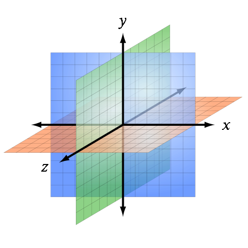
Source: Wikipedia
The child elements of a flex container – known as "flex items" – can be aligned in either direction. (Ignore the z axis in the image above. It doesn't apply here.)
This is flex alignment at its most fundamental level.
The Main and Cross Axes
Overlaying the x and y axes are, in flex layout, the main and cross axes.
By default, the main axis is horizontal (x-axis), and the cross axis is vertical (y-axis). That's the initial setting, as defined by the flexbox specification.

Source: W3C
However, unlike the x and y axes, which are fixed, the main and cross axes can switch directions.
The flex-direction Property
In the image above, the main axis is horizontal and the cross axis is vertical. As mentioned earlier, that's an initial setting of a flex container.
However, these directions can be easily switched with the flex-direction property. This property controls the direction of the main axis; it determines whether flex items align vertically or horizontally.
From the spec:
5.1. Flex Flow Direction: the
flex-directionpropertyThe
flex-directionproperty specifies how flex items are placed in the flex container, by setting the direction of the flex container’s main axis. This determines the direction in which flex items are laid out.
There are four values for the flex-direction property:
/* main axis is horizontal, cross axis is vertical */
flex-direction: row; /* default */
flex-direction: row-reverse;

/* main axis is vertical, cross axis is horizontal */
flex-direction: column;
flex-direction: column-reverse;
The cross axis is always perpendicular to the main axis.
Within the container, flex items exist in a line, known as a "flex line".
A flex line is a row or column, depending on flex-direction.
A container can have one or more lines, depending on flex-wrap.
Single-Line Flex Container
flex-wrap: nowrap establishes a single-line flex container, in which flex items are forced to stay in a single line (even if they overflow the container).
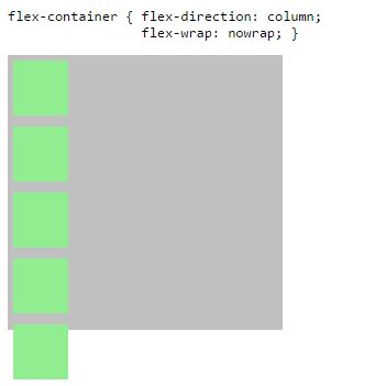
The image above has one flex line.
flex-container {
  display: flex;
  flex-direction: column;
  flex-wrap: nowrap; /* <-- allows single-line flex container */
  width: 250px;
  height: 250px;
  background-color: silver;
}
flex-item {
  flex: 0 0 50px;
  width: 50px;
  margin: 5px;
  background-color: lightgreen;
}
<flex-container>
<flex-item></flex-item>
<flex-item></flex-item>
<flex-item></flex-item>
<flex-item></flex-item>
<flex-item></flex-item>
</flex-container>Multi-Line Flex Container
flex-wrap: wrap or wrap-reverse establishes a multi-line flex container, in which flex items can create new lines.
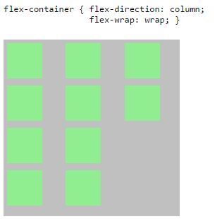
The image above has three flex lines.
flex-container {
  display: flex;
  flex-direction: column;
  flex-wrap: wrap; /* <-- allows multi-line flex container */
  width: 250px;
  height: 250px;
  background-color: silver;
}
flex-item {
  flex: 0 0 50px;
  width: 50px;
  margin: 5px;
  background-color: lightgreen;
}
<flex-container>
<flex-item></flex-item>
<flex-item></flex-item>
<flex-item></flex-item>
<flex-item></flex-item>
<flex-item></flex-item>
<flex-item></flex-item>
<flex-item></flex-item>
<flex-item></flex-item>
<flex-item></flex-item>
<flex-item></flex-item>
</flex-container>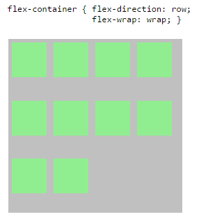
The image above has three flex lines.
flex-container {
  display: flex;
  flex-direction: row;
  flex-wrap: wrap; /* <-- allows multi-line flex container */
  width: 250px;
  height: 250px;
  background-color: silver;
}
flex-item {
  flex: 0 0 50px;
  height: 50px;
  margin: 5px;
  background-color: lightgreen;
}
<flex-container>
<flex-item></flex-item>
<flex-item></flex-item>
<flex-item></flex-item>
<flex-item></flex-item>
<flex-item></flex-item>
<flex-item></flex-item>
<flex-item></flex-item>
<flex-item></flex-item>
<flex-item></flex-item>
<flex-item></flex-item>
</flex-container>Properties are Assigned to the Main and Cross (not X and Y) Axes
While the flex-direction property controls the direction in which flex items are laid out, there are four properties that control alignment and positioning. These are:
align-itemsalign-selfalign-contentjustify-contentEach one of these properties is permanently assigned to an axis.
The justify-content property works only in the main axis.
The three align-* properties work only in the cross axis.
It's a common mistake to assume that these properties are fixed to the x and y axes. For example, justify-content is always horizontal, and align-items is always vertical.
However, when flex-direction is switched to column, the main axis becomes the y-axis, and justify-content works vertically.
The focus of this post is cross-axis alignment. For an explanation of main-axis alignment and the justify-content property, see this post:
Definitions
The flexbox specification provides three keyword properties for cross-axis alignment:
align-itemsalign-selfalign-contentalign-items / align-self
The align-items property aligns flex items along the cross axis of the flex line. It applies to flex containers.
The align-self property is used to override align-items on individual flex items. It applies to flex items.
Here's the definition from the spec:
8.3. Cross-axis Alignment: the
align-itemsandalign-selfpropertiesFlex items can be aligned in the cross axis of the current line of the flex container, similar to
justify-contentbut in the perpendicular direction.align-itemssets the default alignment for all of the flex container’s items.align-selfallows this default alignment to be overridden for individual flex items.
There are six possible values for align-items / align-self:
flex-startflex-endcenterbaselinestretchauto (align-self only)(For a description of each value, click on the spec definition heading above.)
The initial value of align-items is stretch, meaning flex items will expand the full available length of the container's cross axis.
The initial value of align-self is auto, meaning it inherits the value of align-items.
Below is an illustration of the effect of each value in a row-direction container.
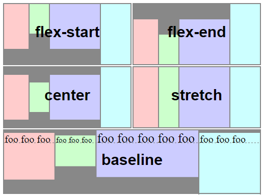
source: W3C
align-contentThis property is slightly more complex than align-items and align-self.
Here's the definition from the spec:
8.4. Packing Flex Lines: the
align-contentpropertyThe
align-contentproperty aligns a flex container’s lines within the flex container when there is extra space in the cross-axis, similar to howjustify-contentaligns individual items within the main-axis. Note, this property has no effect on a single-line flex container.
In contrast to align-items and align-self, which move flex items within their line, align-content moves flex lines within the container.
There are the six possible values for align-content:
flex-startflex-endcenterspace-betweenspace-aroundstretch(For a description of each value, click on the spec definition heading above.)
Below is an illustration of the effect of each value in a row-direction container.
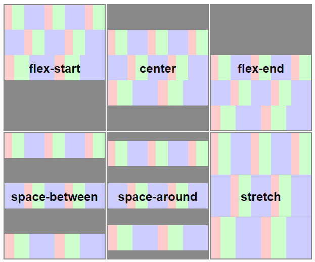
source: W3C
Why does align-content work only in multi-line flex containers?
In a single-line flex container, the cross size of the line is equal to the cross size of the container. This means there is no free space between the line and the container. As a result, align-content can have no effect.
Here's the relevant section from the spec:
Only multi-line flex containers ever have free space in the cross-axis for lines to be aligned in, because in a single-line flex container the sole line automatically stretches to fill the space.
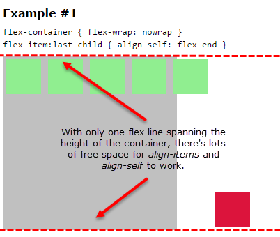
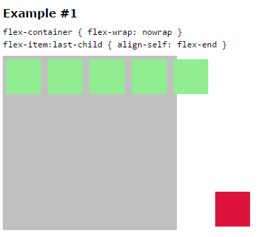
In Example #1, align-self works with flex-wrap: nowrap because the flex items exist in a single-line container. Therefore, there is one flex line and it matches the height of the container.
flex-container {
  display: flex;
  flex-wrap: nowrap;
  align-content: flex-start;
  width: 250px;
  height: 250px;
  background-color: silver;
}
flex-item {
  flex: 0 0 50px;
  height: 50px;
  margin: 5px;
  background-color: lightgreen;
}
flex-item:last-child {
  align-self: flex-end;
  background-color: crimson;
}
<flex-container>
<flex-item></flex-item>
<flex-item></flex-item>
<flex-item></flex-item>
<flex-item></flex-item>
<flex-item></flex-item>
<flex-item></flex-item>
</flex-container>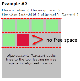
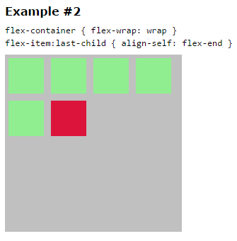
In Example #2, align-self fails because it exists in a multi-line container (flex-wrap: wrap) and align-content is set to flex-start. This means that flex lines are packed tightly to the start of the cross axis, leaving no free space for align-self to work.
flex-container {
  display: flex;
  flex-wrap: wrap;
  align-content: flex-start;
  width: 250px;
  height: 250px;
  background-color: silver;
}
flex-item {
  flex: 0 0 50px;
  height: 50px;
  margin: 5px;
  background-color: lightgreen;
}
flex-item:last-child {
  align-self: flex-end;
  background-color: crimson;
}
<flex-container>
<flex-item></flex-item>
<flex-item></flex-item>
<flex-item></flex-item>
<flex-item></flex-item>
<flex-item></flex-item>
<flex-item></flex-item>
</flex-container>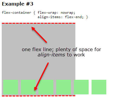
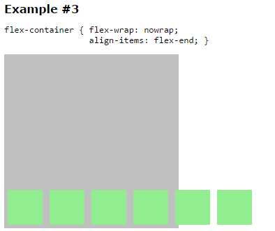
The explanation for Example #3 is the same as for Example #1.
flex-container {
  display: flex;
  flex-wrap: nowrap;
  align-items: flex-end;
  align-content: flex-start;
  width: 250px;
  height: 250px;
  background-color: silver;
}
flex-item {
  flex: 0 0 50px;
  height: 50px;
  margin: 5px;
  background-color: lightgreen;
}
<flex-container>
<flex-item></flex-item>
<flex-item></flex-item>
<flex-item></flex-item>
<flex-item></flex-item>
<flex-item></flex-item>
<flex-item></flex-item>
</flex-container>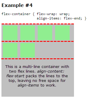
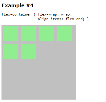
The explanation for Example #4 is the same as for Example #2.
flex-container {
  display: flex;
  flex-wrap: wrap;
  align-items: flex-end;
  align-content: flex-start;
  width: 250px;
  height: 250px;
  background-color: silver;
}

flex-item {
  flex: 0 0 50px;
  height: 50px;
  margin: 5px;
  background-color: lightgreen;
}
<flex-container>
<flex-item></flex-item>
<flex-item></flex-item>
<flex-item></flex-item>
<flex-item></flex-item>
<flex-item></flex-item>
<flex-item></flex-item>
</flex-container>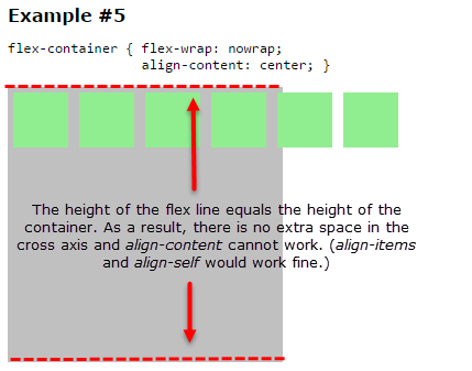
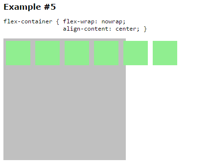
Example #5 is a single-line container. As such, the cross size of the flex line equals the cross size of the container, leaving no extra space between the two. Therefore, align-content, which aligns flex lines when there is extra space in the cross axis, is having no effect.
flex-container {
  display: flex;
  flex-wrap: nowrap;
  align-content: center;
  width: 250px;
  height: 250px;
  background-color: silver;
}

flex-item {
  flex: 0 0 50px;
  height: 50px;
  margin: 5px;
  background-color: lightgreen;
}
<flex-container>
<flex-item></flex-item>
<flex-item></flex-item>
<flex-item></flex-item>
<flex-item></flex-item>
<flex-item></flex-item>
<flex-item></flex-item>
</flex-container>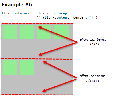
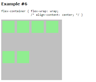
The initial setting for align-content is stretch. This means that if no other value is specified, the container will distribute available space evenly among flex lines. (A similar effect is created on the main axis when all flex items get flex: 1.)
This distribution of space among lines can cause wide gaps between rows / columns. Less lines result in wider gaps. More lines result in smaller gaps, as each line gets a smaller share of the space.
To resolve this problem switch from align-content: stretch to align-content: flex-start. This packs the lines together (see examples #2 and #4 above). Of course, this also eliminates any free space in the line, and align-items and align-self can no longer work.
Here's a related post: Remove space (gaps) between multiple lines of flex items when they wrap
flex-container {
  display: flex;
  flex-wrap: wrap;
  /* align-content: center; */
  width: 250px;
  height: 250px;
  background-color: silver;
}

flex-item {
  flex: 0 0 50px;
  height: 50px;
  margin: 5px;
  background-color: lightgreen;
}
<flex-container>
<flex-item></flex-item>
<flex-item></flex-item>
<flex-item></flex-item>
<flex-item></flex-item>
<flex-item></flex-item>
<flex-item></flex-item>
</flex-container>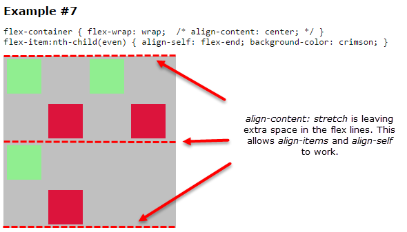
As explained in previous examples, with align-content: stretch, there can be extra space in the flex lines, which allows align-items and align-self to work. Any other value for align-content would pack the lines, eliminating extra space, and making align-items and align-self useless.
flex-container {
  display: flex;
  flex-wrap: wrap;
  /* align-content: center; */
  width: 250px;
  height: 250px;
  background-color: silver;
}
flex-item {
  flex: 0 0 50px;
  height: 50px;
  margin: 5px;
  background-color: lightgreen;
}

flex-item:nth-child(even) {
  align-self: flex-end;
  background-color: crimson;
}
<flex-container>
<flex-item></flex-item>
<flex-item></flex-item>
<flex-item></flex-item>
<flex-item></flex-item>
<flex-item></flex-item>
<flex-item></flex-item>
</flex-container>First of all, align-content is useless if there is no wrap:
w3c doc
The align-content property aligns a flex container’s lines within the flex container when there is extra space in the cross-axis, similar to how justify-content aligns individual items within the main-axis. Note, this property has no effect on a single-line flex container.
Also, in your second case, align-self is not failing. It's useless because the inner lines have been packed. Let's create an space so that the style can work:
flex-container {
  display: flex;
  flex-wrap: wrap;
  align-content: flex-start;
  width: 250px;
  height: 250px;
  background-color: silver;
}
flex-item {
  flex: 0 0 50px;
  height: 50px;
  margin: 5px;
  background-color: lightgreen;
}
flex-item:last-child {
  align-self: flex-end;
  background-color: crimson;
}
flex-item:nth-child(5) {
  height: 90px;  /* added */
}
<flex-container>
<flex-item></flex-item>
<flex-item></flex-item>
<flex-item></flex-item>
<flex-item></flex-item>
<flex-item></flex-item>
<flex-item></flex-item>
</flex-container>Similarly, in your 4th example, the style is working, if you set the conditions where it can be seen
flex-container {
  display: flex;
  flex-wrap: wrap;
  align-items: flex-end;
  align-content: flex-start;
  width: 250px;
  height: 250px;
  background-color: silver;
}

flex-item {
  flex: 0 0 50px;
  height: 50px;
  margin: 5px;
  background-color: lightgreen;
}
flex-item:nth-child(2),flex-item:nth-child(5) {
  height: 90px;  /* added */
}
<flex-container>
<flex-item></flex-item>
<flex-item></flex-item>
<flex-item></flex-item>
<flex-item></flex-item>
<flex-item></flex-item>
<flex-item></flex-item>
</flex-container>Finally, when you comment the align-content, it reverts to stretch, that's why the lines increase the size to fill up the container
stretch Lines stretch to take up the remaining space. If the leftover free-space is negative, this value is identical to flex-start. Otherwise, the free-space is split equally between all of the lines, increasing their cross size.
6
If you love us? You can donate to us via Paypal or buy me a coffee so we can maintain and grow! Thank you!
Donate Us With

