 Menu
Menu
I'm wondering if there's an easier way to create circular divs than what I'm doing now.
Currently, I am just making an image for each different size, but it's annoying to do this.
Is there anyway using CSS to make divs which are circular and I can specify the radius?
 280
280
To create a circle we can set the border-radius on the element. This will create curved corners on the element. If we set it to 50% it will create a circle. If you set a different width and height we will get an oval instead.
Just add the border-radius:50%; to circular_image Class.
How can I change the position of DIV over an image ? One way is to add position: relative; to your image and then abosolute position the div according to it. fredda: One way is to add position: relative; to your image and then abosolute position the div according to it.
Here's a demo: http://jsfiddle.net/thirtydot/JJytE/1170/
CSS:
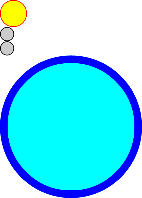
.circleBase { border-radius: 50%; behavior: url(PIE.htc); /* remove if you don't care about IE8 */ } .type1 { width: 100px; height: 100px; background: yellow; border: 3px solid red; } .type2 { width: 50px; height: 50px; background: #ccc; border: 3px solid #000; } .type3 { width: 500px; height: 500px; background: aqua; border: 30px solid blue; } HTML:
<div class="circleBase type1"></div> <div class="circleBase type2"></div><div class="circleBase type2"></div> <div class="circleBase type3"></div> To make this work in IE8 and older, you must download and use CSS3 PIE. My demo above won't work in IE8, but that's only because jsFiddle doesn't host PIE.htc.
My demo looks like this:
111
If you love us? You can donate to us via Paypal or buy me a coffee so we can maintain and grow! Thank you!
Donate Us With

