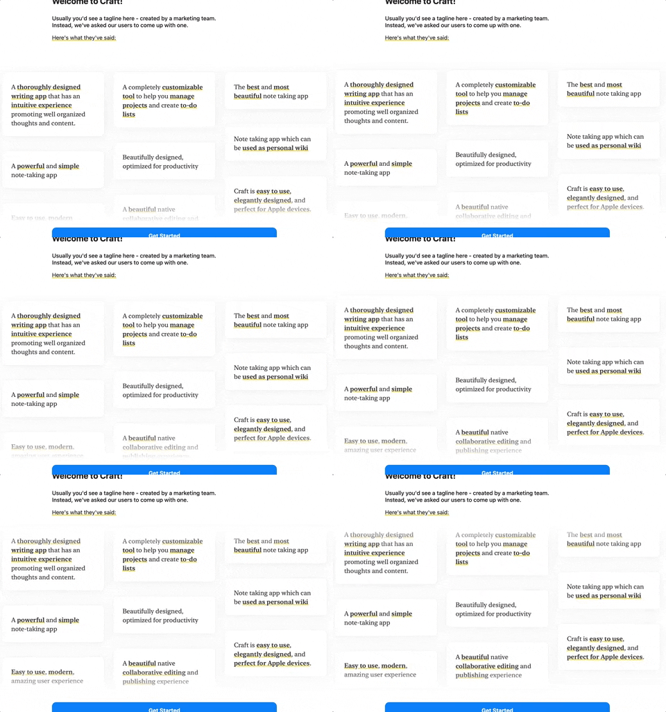
I want to use CSS animation to move these divs upwards as shown in the GIF attached below.
All the divs move upwards at the same speed.
I tried the marquee tag but from what I heard, it's depreciated or will be depreciated soon. So I can't use it.
I have never done CSS animation. So would really appreciate your help.
Each column has 6 items. When the entire 6 items are finished, it starts from item 1 again. Elements that overflow remain hidden, till all other items are displayed and then appear from the bottom again after the 6th element.


.gridcontainer{
  background: black;
  width: 100%;
  padding: 20px;
  margin: 5px;
  color: white;
  border-radius: 10px;


}

.grid{
display:grid;
justify-items: center
}


    .grid--1x3{
      grid-template-columns: 1fr 1fr 1fr;
     justify-items: "center"
    }

    .flexcolumn {
    display:flex;
    flex-direction: column;
    }
<div class='grid grid--1x3'>
<div class='flexcolumn'>
<span class='gridcontainer'>Element A</span>
<span class='gridcontainer'>Element B</span>
<span class='gridcontainer'>Element C</span>
<span class='gridcontainer'>Element D</span>
<span class='gridcontainer'>Element E</span>
<span class='gridcontainer'>Element F</span>
</div>
</div> asked Jan 23 '26 23:01
One way of achieving a continuous movement is to have two copies of everything within a single container.
Then the container is translated upwards but just half of its height - the second copy will be overwritten by the first at the end of the animation so things look continuous.
This snippet assumes that the outer container may be of a different (smaller) height (as shown in the gif - not all the messages show at once) - so there is an outer container with overflow hidden and an inner container which is what is translated upwards.
<style>
* {
margin: 0;
padding: 0;
box-sizing: border-box;
}
.gridcontainer {
background: black;
width: 100%;
padding: 20px;
margin: 5px;
color: white;
border-radius: 10px;
}
.outer {
overflow: hidden;
height: 400px;
width: 100vw;
display: flex;
justify-content: center;
}
.inner {
animation: move 10s linear infinite;
rposition: relative;
height: fit-content;
}
@keyframes move {
0% {
transform: translateY(0);
}
100% {
transform: translateY(-50%);
}
}
.grid {
display: grid;
gap: 2vw;
justify-content: space-around;
height: fit-content;
}
.grid--1x3 {
grid-template-columns: 1fr 1fr 1fr;
}
.flexcolumn {
display: flex;
flex-direction: column;
}
</style>
<div class="outer">
<div class="inner">
    <div class='grid grid--1x3'>

<div class='flexcolumn'>
<span class='gridcontainer'>Element A</span>
<span class='gridcontainer'>Element B</span>
<span class='gridcontainer'>Element C</span>
<span class='gridcontainer'>Element D</span>
<span class='gridcontainer'>Element E</span>
<span class='gridcontainer'>Element F</span>

</div>
<div class='flexcolumn'>
<span class='gridcontainer'>Element A</span>
<span class='gridcontainer'>Element B</span>
<span class='gridcontainer'>Element C</span>
<span class='gridcontainer'>Element D</span>
<span class='gridcontainer'>Element E</span>
<span class='gridcontainer'>Element F</span>

</div>

<div class='flexcolumn'>
<span class='gridcontainer'>Element A</span>
<span class='gridcontainer'>Element B</span>
<span class='gridcontainer'>Element C</span>
<span class='gridcontainer'>Element D</span>
<span class='gridcontainer'>Element E</span>
<span class='gridcontainer'>Element F</span>

</div>

</div>
</div>
</div>If you love us? You can donate to us via Paypal or buy me a coffee so we can maintain and grow! Thank you!
Donate Us With