 Menu
Menu
In your sample create a div inside #content with this style
#content_over_shadow {
    padding: 1em;
    position: relative; /* look at this */
    background:#fff;    /* a solid background (non transparent) */
}
and change #content style (remove paddings) and add shadow
#content {
    font-size: 1.8em;
    box-shadow: 0 0 8px 2px #888; /* line shadow */
}
add shadows to tabs:
#nav li a {
    margin-left: 20px;
    padding: .7em .5em .5em .5em;
    font-size: 1.3em;
    color: #FFF;
    display: inline-block;
    text-transform: uppercase;
    position: relative;
    box-shadow: 0 0 8px 2px #888; /* the shadow */
}
Cut it off with overflow.
div div {box-shadow:0 0 5px #000; height:20px}
div {overflow:hidden;height:25px; padding:5px 5px 0 5px}<div><div>tab</div></div>You can use multiple CSS shadows without any other divs to get desired effect, with the caveat of of no shadows around the corners.
div.shadow {
    -webkit-box-shadow: 0 -3px 3px -3px black, 3px 0px 3px -3px black, -3px 0px 3px -3px black;
    -moz-box-shadow:    0 -3px 3px -3px black, 3px 0px 3px -3px black, -3px 0px 3px -3px black;
    box-shadow:         0 -3px 3px -3px black, 3px 0px 3px -3px black, -3px 0px 3px -3px black;
    height: 25px
}
<div style="height: 25px"><div class="shadow">tab</div></div>Overall though its very unintrusive.
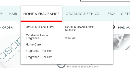
One more, rather creative, way of solving this problem is adding :after or :before pseudo element to one of the elements. In my case it looks like this:
#magik_megamenu>li:hover>a:after {
    height: 5px;
    width: 100%;
    background: white;
    content: '';
    position: absolute;
    bottom: -3px;
    left: 0;
}
See the screenshot, made the pseudo element red to make it more visible.
If you love us? You can donate to us via Paypal or buy me a coffee so we can maintain and grow! Thank you!
Donate Us With