 Menu
Menu
The documentation for the OutlineButton says that the color property fills the button color and is transparent by default. Specifically the Flutter documentation says of the color property: "color → Color
The button's fill color, displayed by its Material, while it is in its default (unpressed, enabled) state."
But setting the color property has no effect:
OutlineButton(
        color: Colors.orange,
        textColor: BmsColors.primaryForegroundColor,
        borderSide: BorderSide(color: BmsColors.primaryForegroundColor, width: 2.0),
        shape: new RoundedRectangleBorder(
          borderRadius:
              new BorderRadius.circular(8.0),
        ),
        child: Text(
          this.text,
          style: TextStyle(fontFamily: 'Lalezar', fontWeight: FontWeight.w400),
        ),
        onPressed: () {},
      );
 281
281
If you check the source code of OutlineButton there is a method to get the fillColor
      Color _getFillColor() {
        if (widget.highlightElevation == null || widget.highlightElevation == 0.0)
          return Colors.transparent;
        final Color color = widget.color ?? Theme.of(context).canvasColor;
        final Tween<Color> colorTween = ColorTween(
          begin: color.withAlpha(0x00),
          end: color.withAlpha(0xFF),
        );
        return colorTween.evaluate(_fillAnimation);
      }
But this method has an if condition, it uses the color only when the highlightElevation is different from 0, and also it uses the animation of the colorTween from color.withAlpha(0x00) to color.withAlpha(0xFF).
So it change from transparent to your color when you press it.
You can create your own OutlineButton widget if you want , this a sample I made:
    class MyCustomOutlineButton extends StatelessWidget {
      final String text;
      final VoidCallback onPressed;
      final Color color;

      const MyCustomOutlineButton({Key key, this.text, this.onPressed, this.color})
          : super(key: key);

      @override
      Widget build(BuildContext context) {
        return Container(
          decoration: BoxDecoration(
            border: Border.all(color: Colors.yellow, width: 2.0),
            color: color,
            borderRadius: BorderRadius.circular(8.0),
          ),
          margin: EdgeInsets.all(2.0),
          child: RawMaterialButton(
            fillColor: color,
            elevation: 0,
            shape: RoundedRectangleBorder(
              borderRadius: BorderRadius.circular(8.0),
            ),
            child: Padding(
              padding: const EdgeInsets.symmetric(horizontal: 14.0),
              child: Text(
                text,
                style: TextStyle(
                    fontFamily: 'Lalezar',
                    fontWeight: FontWeight.w400,
                    color: Colors.yellow),
              ),
            ),
            onPressed: onPressed,
          ),
        );
      }
    }
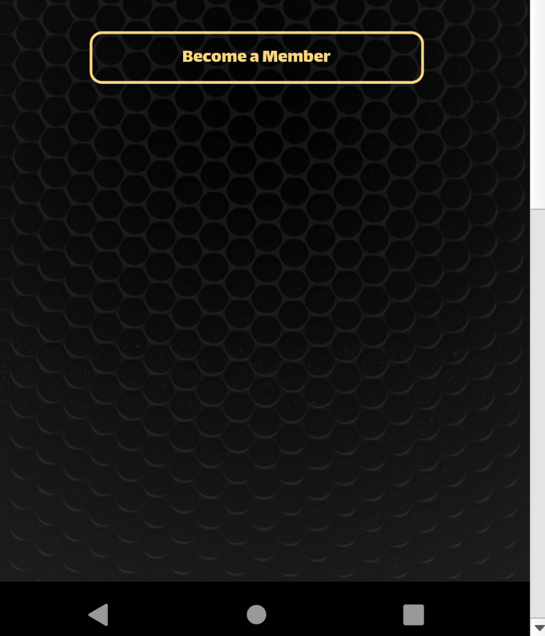
Usage
  MyCustomOutlineButton(
            text: "Become a Member",
            color: Colors.orange,
            onPressed: () {
              print("here");
            },
          ),
If you love us? You can donate to us via Paypal or buy me a coffee so we can maintain and grow! Thank you!
Donate Us With