 Menu
Menu
I want to place a Bootstrap Carousel slider inside a PC screen image, so I want to fit it perfectly inside that screen and also be responsive.
I dont know which is the best way, but I've tried making the screen image like background image of the slider in css, but it doesn't work. Can anyone help me? or have a better idea?
For example:
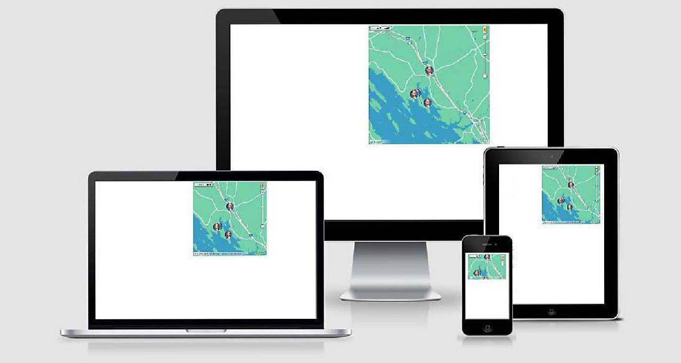 (There are many screens on this example, but is the spirit of what i want to achieve)
Carousel code:
<!DOCTYPE html>
<html lang="en">
<head>
<title>Bootstrap Example</title>
<meta charset="utf-8">
<meta name="viewport" content="width=device-width, initial-scale=1">
<link rel="stylesheet" href="https://maxcdn.bootstrapcdn.com/bootstrap/3.3.7/css/bootstrap.min.css">
<link rel="stylesheet" href="main.css">
<script src="https://ajax.googleapis.com/ajax/libs/jquery/3.1.1/jquery.min.js"></script>
<script src="https://maxcdn.bootstrapcdn.com/bootstrap/3.3.7/js/bootstrap.min.js"></script>
</head>
<body>
<div class="container">
<br>
<div id="myCarousel" class="carousel slide" data-ride="carousel">
<!-- Indicators -->
<ol class="carousel-indicators">
<li data-target="#myCarousel" data-slide-to="0" class="active"></li>
<li data-target="#myCarousel" data-slide-to="1"></li>
<li data-target="#myCarousel" data-slide-to="2"></li>
<li data-target="#myCarousel" data-slide-to="3"></li>
</ol>
<!-- Wrapper for slides -->
<div class="carousel-inner screen" role="listbox">
<div class="item active">
<img src="http://placehold.it/712x400">
</div>
<div class="item">
<img src="http://placehold.it/712x400">
</div>
<div class="item">
<img src="http://placehold.it/712x400" >
</div>
</div>
</div>
</div>
</body>
</html> 938
938
 asked May 26 '26 04:05
I had the same problem but finally found the solution!
You can try this mockup: HTML5 DEVICE MOCKUPS
<div class="device-mockup" data-device="iphone5" data-orientation="portrait" data-color="black">
            <div class="device">
                <div class="screen">
                    <!-- PUT CONTENTS HERE -->
                    You can put your slider here. The images will be automatically responsive with the device.
                </div>
                <div class="button">
                    <!-- You can hook the "home button" to some JavaScript events or just remove it -->
                </div>
            </div>
        </div>
Just read the documentations and its explanation on their github. Hope this helps!
160
answered May 28 '26 17:05
If you love us? You can donate to us via Paypal or buy me a coffee so we can maintain and grow! Thank you!
Donate Us With