Menu
Menu
Using antd NPM package, select component, in multiple mode, by default checkbox shows up at right. I want to align it to left and style it like tick mark in the box followed by a label. Also, need search box separately please refer screenshot added. I wanted to know it is even possible? I don't want to use any other package.
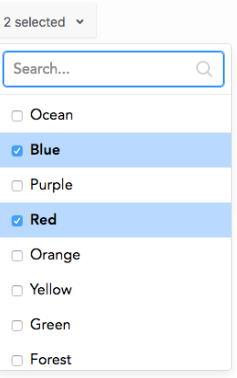
Searched a lot but unable to get any help.
Thanks in advance.
 623
623
 asked Jul 22 '26 06:07
It is possible, but it breaks the Design System of antd.
You already have a Select component which implements checking, drop-down and searching:
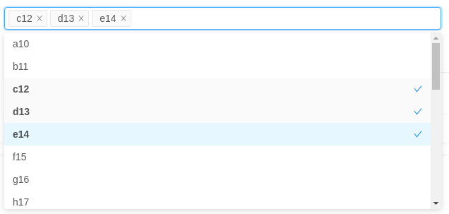
In your case, you need to implement and test it by yourself with the composition of antd components:
Input.SearchCheckboxDropdownMenuMinimal example:
const menu = (
  <Menu>
    <Menu.Item>
      <Checkbox>User1</Checkbox>
    </Menu.Item>
    <Menu.Item>
      <Checkbox>User2</Checkbox>
    </Menu.Item>
  </Menu>
);
export default function App() {
  return (
    <FlexBox>
      <Dropdown.Button overlay={menu}>Dropdown</Dropdown.Button>
    </FlexBox>
  );
}

140
If you love us? You can donate to us via Paypal or buy me a coffee so we can maintain and grow! Thank you!
Donate Us With