 Menu
Menu
float: left… 🤔Below are the most common ways to achieve two elements side-by-side…
Some basic css styles for parent and child elements in these examples:
.parent {
  background: mediumpurple;
  padding: 1rem;
}
.child {
  border: 1px solid indigo;
  padding: 1rem;
}
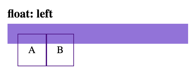
Using the float solution my have unintended affect on other elements. (Hint: You may need to use a clearfix.)
html
<div class='parent'>
  <div class='child float-left-child'>A</div>
  <div class='child float-left-child'>B</div>
</div>
css
.float-left-child {
  float: left;
}
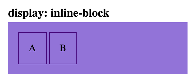
html
<div class='parent'>
  <div class='child inline-block-child'>A</div>
  <div class='child inline-block-child'>B</div>
</div>
css
.inline-block-child {
  display: inline-block;
}
Note: the space between these two child elements can be removed, by removing the space between the div tags:
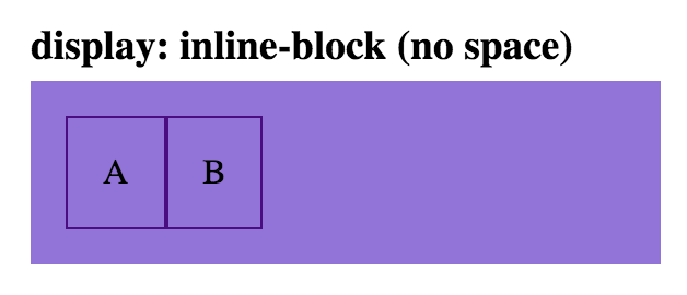
html
<div class='parent'>
  <div class='child inline-block-child'>A</div><div class='child inline-block-child'>B</div>
</div>
css
.inline-block-child {
  display: inline-block;
}

html
<div class='parent flex-parent'>
  <div class='child flex-child'>A</div>
  <div class='child flex-child'>B</div>
</div>
css
.flex-parent {
  display: flex;
}
.flex-child {
  flex: 1;
}
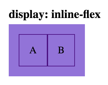
html
<div class='parent inline-flex-parent'>
  <div class='child'>A</div>
  <div class='child'>B</div>
</div>
css
.inline-flex-parent {
  display: inline-flex;
}
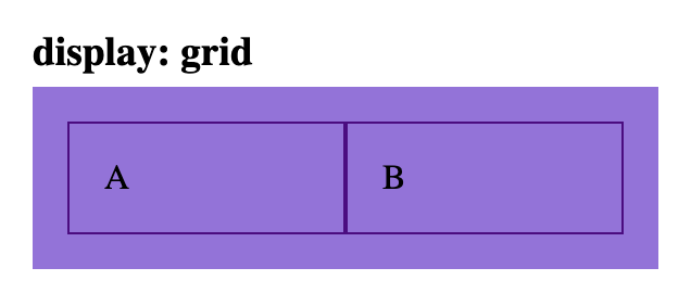
html
<div class='parent grid-parent'>
  <div class='child'>A</div>
  <div class='child'>B</div>
</div>
css
.grid-parent {
  display: grid;
  grid-template-columns: 1fr 1fr
}
Apply float:left; to both of your divs should make them stand side by side.
keep it simple
<div align="center">
<div style="display: inline-block"> <img src="img1.png"> </div>
<div style="display: inline-block"> <img src="img2.png"> </div>
</div>
If you love us? You can donate to us via Paypal or buy me a coffee so we can maintain and grow! Thank you!
Donate Us With