 Menu
Menu
I try to use padding to increase the touch area of a button. I use
<ImageButton
    android:paddingRight="32dp"
    android:paddingEnd="32dp"
    android:id="@+id/confirm_image_button"
    android:layout_width="wrap_content"
    android:layout_height="wrap_content"
    android:layout_alignParentEnd="true"
    android:layout_alignParentRight="true"
    android:layout_centerVertical="true"
    android:background="?selectableItemBackgroundBorderless"
    android:src="?attr/confirmIcon" />
The click area is enlarge. But, selectableItemBackgroundBorderless click effect no longer shown as a perfect circle.
I try to use duplicateParentState technique to overcome.
<FrameLayout
    android:clickable="true"
    android:paddingRight="32dp"
    android:paddingEnd="32dp"
    android:layout_width="wrap_content"
    android:layout_height="wrap_content"
    android:layout_alignParentEnd="true"
    android:layout_alignParentRight="true"
    android:layout_centerVertical="true">
    <ImageButton
        android:duplicateParentState="true"
        android:id="@+id/confirm_image_button"
        android:layout_width="wrap_content"
        android:layout_height="wrap_content"
        android:background="?selectableItemBackgroundBorderless"
        android:src="?attr/confirmIcon" />
</FrameLayout>
Now,
selectableItemBackgroundBorderless circle effect is a perfect circle.However, it seems to have some weird behavior. When I click on the actual area of the ImageButton, the circle press effect is not shown.
May I know why it is so, and how can I overcome it? I tested using API 26.
Note, I try to avoid using TouchDelegate technique, unless I'm forced to, as it makes our code more complicated.
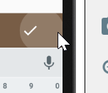
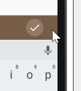
The following is the correct behavior, exhibited by the button for Toolbar.
Ripple effect is shown when the click region is outside the button
Ripple effect is shown when the click region is within the button
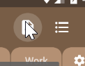
However, I have no idea how they implement such behavior.
 247
247
After spending some time I finally found how the "toolbar mystery" works. It's ActionMenuItemView, that is being displayed on the toolbar. And you can see, that inside xml file it has style="?attr/actionButtonStyle" applied to it. ?attr/actionButtonStyle corresponds to Widget.Material.ActionButton and within this style we can see <item name="background">?attr/actionBarItemBackground</item>.
If you want to apply the same effect to your ImageButton, then all you have to do is to apply android:background="?attr/actionBarItemBackground" to it. Thus, having following xml layout:
<ImageButton
    android:id="@+id/confirm_image_button"
    android:layout_width="50dp"
    android:layout_height="50dp"
    android:background="?attr/actionBarItemBackground"
    android:src="@drawable/ic_check_black_24dp" />
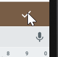
You'll receive this output:
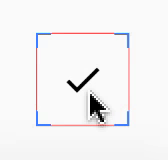
Turned on "Show layout bounds" so that actual bounds of ImageButton are visible
If you are curious what ?attr/actionBarItemBackground actually represents, here's it:
<?xml version="1.0" encoding="utf-8"?>
<ripple xmlns:android="http://schemas.android.com/apk/res/android"
    android:color="?attr/colorControlHighlight"
    android:radius="20dp" />
Thus, you can create your drawable and apply it as a background to ImageButton.
200
If you love us? You can donate to us via Paypal or buy me a coffee so we can maintain and grow! Thank you!
Donate Us With